<UserProfile /> component
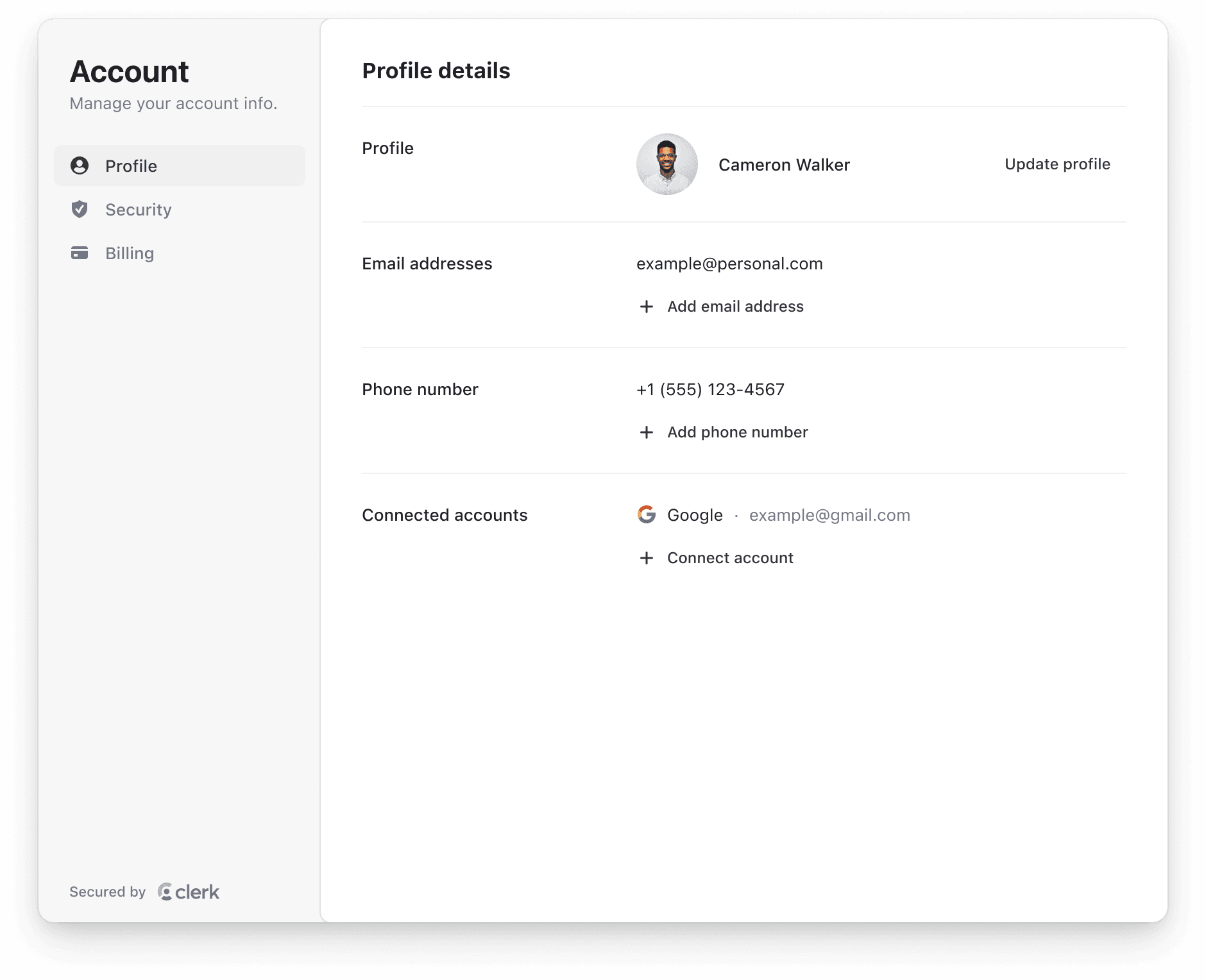
The <UserProfile /> component is used to render a beautiful, full-featured account management UI that allows users to manage their profile, security, and billing settings.
<script setup>
// Components are automatically imported
</script>

<template>
  <UserProfile />
</template>
Properties
All props are optional.
- Name
appearance- Type
Appearance | undefined- Description
Optional object to style your components. Will only affect Clerk components and not Account Portal pages.
- Name
routing- Type
'hash' | 'path'- Description
The routing strategy for your pages. Defaults to
'path'for frameworks that handle routing, such as Next.js and Remix. Defaults tohashfor all other SDK's, such as React.
- Name
path- Type
string- Description
The path where the component is mounted on when
routingis set topath. It is ignored in hash-based routing. For example:/user-profile.
- Name
additionalOAuthScopes- Type
object- Description
Specify additional scopes per OAuth provider that your users would like to provide if not already approved. For example:
{google: ['foo', 'bar'], github: ['qux']}.
- Name
customPages- Type
[]- Description
An array of custom pages to add to the user profile. Only available for the . To add custom pages with React-based SDK's, see the dedicated guide.
- Name
fallback?- Type
ReactNode- Description
An optional element to be rendered while the component is mounting.
Customization
To learn about how to customize Clerk components, see the customization documentation.
In addition, you also can add custom pages and links to the <UserProfile /> navigation sidenav. For more information, refer to the Custom Pages documentation.
Feedback
Last updated on