<PricingTable />
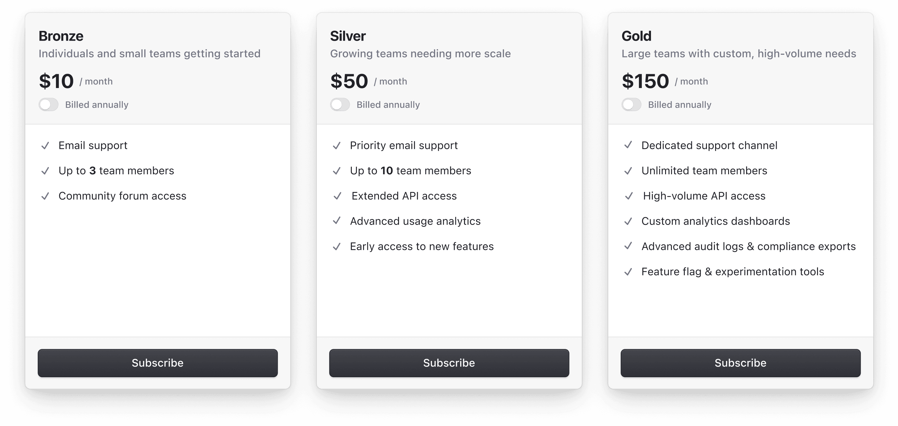
The <PricingTable /> component displays a table of Plans and Features that users can subscribe to.
Example
The following example includes a basic implementation of the <PricingTable /> component. You can use this as a starting point for your own implementation.
import { PricingTable } from '@clerk/clerk-expo/web'

export default function PricingPage() {
  return <PricingTable />
}
Properties
All props are optional.
- Name
appearance- Type
Appearance | undefined- Description
Optional object to style your components. Will only affect Clerk components and not Account Portal pages.
- Name
checkoutProps- Type
{ appearance: Appearance }- Description
Options for the checkout drawer. Accepts the following properties:
appearance: an object used to style your components. Will only affect Clerk components and not Account Portal pages.
- Name
collapseFeatures- Type
boolean- Description
A boolean that indicates whether the features are collapsed. Requires
layoutto be set to'default'. Defaults tofalse.
- Name
ctaPosition- Type
'top' | 'bottom'- Description
The placement of the CTA button. Requires
layoutto be set to'default'. Defaults to'bottom'.
- Name
fallback- Type
JSX- Description
An optional UI to show when the pricing table is loading.
- Name
for- Type
'user' | 'organization'- Description
A string that indicates whether the pricing table is for users or organizations. If
'user', the pricing table will display a list of plans and features that users can subscribe to. If'organization', the pricing table will display a list of plans and features that organizations can subscribe to. Defaults to'user'.
- Name
newSubscriptionRedirectUrl- Type
string- Description
The URL to navigate to after the user completes the checkout and selects the "Continue" button.
Feedback
Last updated on