<UserButton /> component
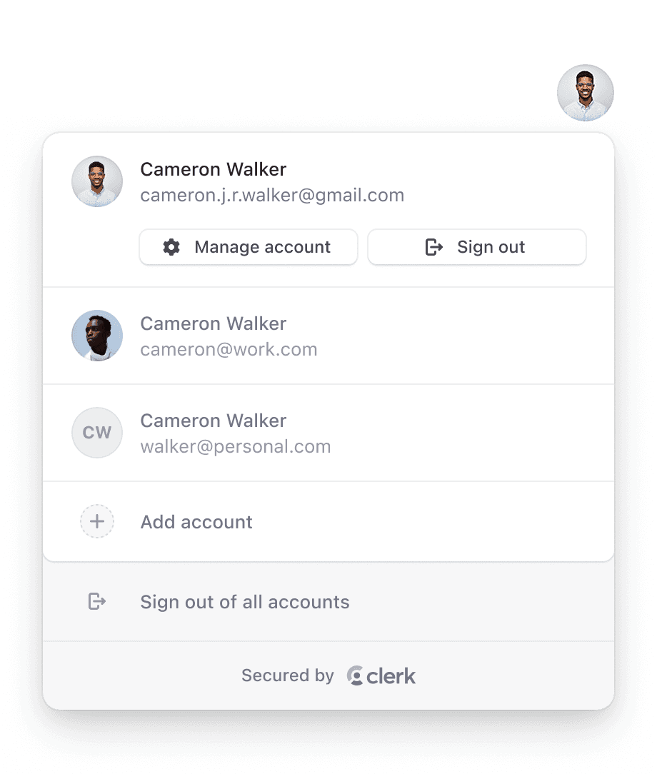
The <UserButton /> component renders the familiar user button UI popularized by Google. When selected, it opens a dropdown menu with options to manage account settings and sign out. The "Manage account" option launches the <UserProfile /> component, providing access to profile and security settings.
For users that have multi-session enabled, the <UserButton /> also allows users to sign into multiple accounts at once and instantly switch between them without the need for a full page reload. Learn more here.
Example
In the following example, <UserButton /> is mounted inside a header component, which is a common pattern on many websites and applications. When the user is signed in, they will see their avatar and be able to open the popup menu.
import { ClerkProvider, SignedIn, SignedOut, SignInButton, UserButton } from '@clerk/nextjs'

function Header() {
  return (
    <header style={{ display: 'flex', justifyContent: 'space-between', padding: 20 }}>
      <h1>My App</h1>
      <SignedIn>
        <UserButton />
      </SignedIn>
      <SignedOut>
        <SignInButton />
      </SignedOut>
    </header>
  )
}

export default function RootLayout({ children }: { children: React.ReactNode }) {
  return (
    <html lang="en">
      <ClerkProvider>
        <Header />
        {children}
      </ClerkProvider>
    </html>
  )
}import { ClerkProvider, SignedIn, SignedOut, SignInButton, UserButton } from '@clerk/nextjs'
import type { AppProps } from 'next/app'
function Header() {
return (
<header style={{ display: 'flex', justifyContent: 'space-between', padding: 20 }}>
<h1>My App</h1>
<SignedIn>
<UserButton />
</SignedIn>
<SignedOut>
<SignInButton />
</SignedOut>
</header>
)
}
function MyApp({ pageProps, Component }: AppProps) {
return (
<ClerkProvider {...pageProps}>
<Header />
<Component {...pageProps} />
</ClerkProvider>
)
}
export default MyAppProperties
The <UserButton /> component accepts the following properties, all of which are optional:
- Name
afterMultiSessionSingleSignOutUrl(deprecated)- Type
string- Description
Deprecated. Move
afterMultiSessionSingleSignOutUrlto <ClerkProvider />. The full URL or path to navigate to after signing out from a currently active account in a multi-session app.
- Name
afterSignOutUrl(deprecated)- Type
string- Description
Deprecated. Move
afterSignOutUrlto <ClerkProvider />. The full URL or path to navigate to after a successful sign-out.
- Name
afterSwitchSessionUrl- Type
string- Description
The full URL or path to navigate to after a successful account change in a multi-session app.
- Name
appearance- Type
Appearance | undefined- Description
Optional object to style your components. Will only affect Clerk components and not Account Portal pages.
- Name
defaultOpen- Type
boolean- Description
Controls whether the
<UserButton />should open by default during the first render.
- Name
showName- Type
boolean- Description
Controls if the user name is displayed next to the user image button.
- Name
signInUrl- Type
string- Description
The full URL or path to navigate to when the Add another account button is clicked. It's recommended to use the environment variable instead.
- Name
userProfileMode- Type
'modal' | 'navigation'- Description
Controls whether selecting the Manage your account button will cause the <UserProfile /> component to open as a modal, or if the browser will navigate to the
userProfileUrlwhere<UserProfile />is mounted as a page. Defaults to:'modal'.
- Name
userProfileProps- Type
object- Description
Specify options for the underlying <UserProfile /> component. For example:
{additionalOAuthScopes: {google: ['foo', 'bar'], github: ['qux']}}.
- Name
userProfileUrl- Type
string- Description
The full URL or path leading to the user management interface.
- Name
fallback?- Type
ReactNode- Description
An optional element to be rendered while the component is mounting.
Customization
To learn about how to customize Clerk components, see the customization documentation.
You can also add custom actions and links to the <UserButton /> menu.
Feedback
Last updated on