<PlanDetailsButton /> component
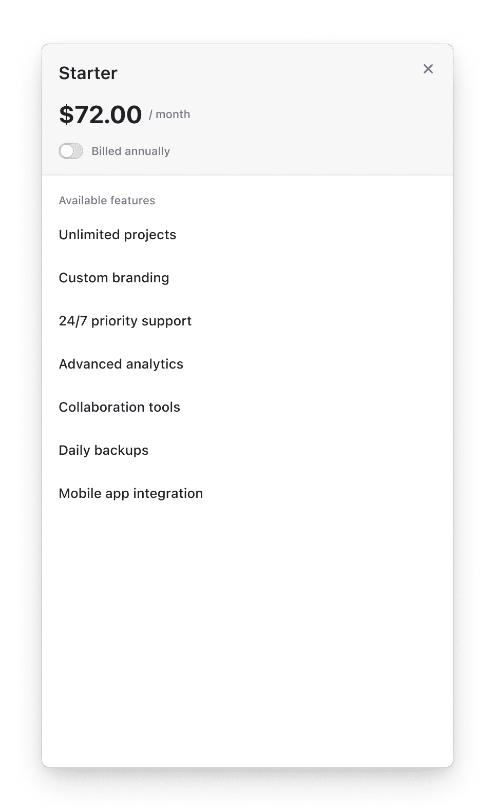
The <PlanDetailsButton /> component renders a button that opens the plan details drawer, allowing users to view detailed information about a specific plan, including pricing, features, and other plan-specific details.
Usage
<PlanDetailsButton /> preserves any click handlers attached to custom button elements, while maintaining the plan details drawer functionality.
<PlanDetailsButton planId="cplan_xxx">
  <button onClick={() => console.log('Button clicked')} className="custom-button">
    View Plan
  </button>
</PlanDetailsButton>
<PlanDetailsButton /> supports rendering the plan details drawer in a custom portal container.
const portalRoot = document.getElementById('custom-portal')

<PlanDetailsButton
  planId="cplan_xxx"
  planDetailsProps={{
    portalId: 'custom-portal',
    portalRoot: portalRoot,
  }}
/><script setup lang="ts">
import { PlanDetailsButton } from '@clerk/vue/experimental'
</script>
<template>
<div>
<!-- Basic usage with plan ID -->
<PlanDetailsButton planId="cplan_xxx" />
<!-- Customizes the appearance of the plan details drawer -->
<PlanDetailsButton
planId="cplan_xxx"
initialPlanPeriod="month"
:planDetailsProps="{
appearance: {
/* custom theme */
},
}"
/>
<!-- Custom button -->
<PlanDetailsButton planId="cplan_xxx">
<button class="custom-button">View Plan Features</button>
</PlanDetailsButton>
</div>
</template>- Name
planId?- Type
string- Description
The ID of the plan to display details for. It is required if
planis not provided.
- Name
plan?- Type
- Description
The plan to display details for. It is used as initial data until the plan is fetched from the server.
- Name
children?- Type
React.ReactNode- Description
Optional custom button element. If not provided, defaults to a button with the text "Plan details".
- Name
initialPlanPeriod?- Type
'month' | 'annual'- Description
Optional prop to set the initial billing period view when the plan details drawer opens.
- Name
planDetailsProps?- Type
{ appearance: Appearance }- Description
Options for the plan details drawer. Accepts the following properties:
appearance: an object used to style your components. For example:<PlanDetailsButton planDetailsProps={{ appearance: { ... } }} />.
Feedback
Last updated on