ClerkTheme
The ClerkTheme is used to customize the appearance of Clerk iOS components by adjusting colors, fonts, and design properties. It provides a comprehensive theming system that allows you to create a consistent visual experience across all Clerk components.
Structure
ClerkTheme consists of three main properties:
colors- Color properties for various UI elements.fonts- Font properties for different text styles.design- Design properties like border radius.
Colors
The colors property contains the following color options:
- Name
primary- Type
Color- Description
The primary color used throughout the components.
- Name
background- Type
Color- Description
The background color for containers.
- Name
input- Type
Color- Description
The background color used for input fields.
- Name
danger- Type
Color- Description
The color used for error states.
- Name
success- Type
Color- Description
The color used for success states.
- Name
warning- Type
Color- Description
The color used for warning states.
- Name
foreground- Type
Color- Description
The color used for text.
- Name
mutedForeground- Type
Color- Description
The color used for secondary text.
- Name
primaryForeground- Type
Color- Description
The color used for text on the primary background.
- Name
inputForeground- Type
Color- Description
The color used for text in input fields.
- Name
neutral- Type
Color- Description
The color that will be used to generate the neutral shades the components use.
- Name
ring- Type
Color- Description
The color of the ring when an interactive element is focused.
- Name
muted- Type
Color- Description
The color used for muted backgrounds.
- Name
shadow- Type
Color- Description
The base shadow color used in the components.
- Name
border- Type
Color- Description
The base border color used in the components.
Fonts
The fonts property contains the following font options based on iOS Dynamic Type:
- Name
largeTitle- Type
Font- Description
- Name
title- Type
Font- Description
- Name
title2- Type
Font- Description
- Name
title3- Type
Font- Description
- Name
headline- Type
Font- Description
- Name
subheadline- Type
Font- Description
- Name
body- Type
Font- Description
- Name
callout- Type
Font- Description
- Name
footnote- Type
Font- Description
- Name
caption- Type
Font- Description
- Name
caption2- Type
Font- Description
Design
The design property contains the following design options:
- Name
borderRadius- Type
CGFloat- Description
The border radius used throughout the components. By default, this is set to
6.0.
Usage
You can customize Clerk iOS components by creating a ClerkTheme and applying it to the SwiftUI environment.
Apply a custom theme to all Clerk components
To customize all Clerk components in your app, create a ClerkTheme and apply it to your root view using the environment.
import SwiftUI
import Clerk

struct MyApp: App {
  var body: some Scene {
    WindowGroup {
      ContentView()
        .environment(\.clerkTheme, customTheme)
    }
  }

  let customTheme = ClerkTheme(
    colors: .init(
      primary: .blue,
    ),
    design: .init(
      borderRadius: 12.0
    )
  )
}
Apply a theme to specific components
You can apply a theme to specific Clerk components by using the environment modifier on individual views. The theme used here will apply to all children of this view.
struct SignInView: View {
  var body: some View {
    AuthView()
      .environment(\.clerkTheme, customTheme)
  }

  let customTheme = ClerkTheme(
    colors: .init(
      primary: .purple,
    )
  )
}
Adjust a specific property of the theme
You can adjust a specific property of the theme by modifying a single property.
struct SignInView: View {
  var body: some View {
    AuthView()
      .environment(\.clerkTheme.colors.primary, .green)
  }
}
Custom fonts
You can customize fonts by providing a font family name or individual font specifications.
Using a font family name
struct CustomFontView: View {
  var body: some View {
    AuthView()
      .environment(\.clerkTheme, customTheme)
  }

  let customTheme = ClerkTheme(
    fonts: .init(fontFamily: "Helvetica Neue")
  )
}struct CustomFontView: View {
var body: some View {
AuthView()
.environment(\.clerkTheme, customTheme)
}
let customTheme = ClerkTheme(
fonts: .init(
largeTitle: .init(name: "Helvetica Neue", size: 34.0),
title: .init(name: "Helvetica Neue", size: 28.0),
title2: .init(name: "Helvetica Neue", size: 22.0),
title3: .init(name: "Helvetica Neue", size: 20.0),
headline: .init(name: "Helvetica Neue", size: 18.0),
)
)
}Light and Dark Mode Support
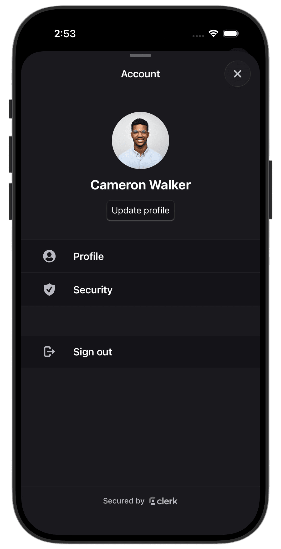
Clerk iOS components automatically support both light and dark mode appearance, adapting seamlessly to the user's system preferences.
Using Asset Catalog Colors
For more sophisticated appearance support, create colors in your Asset Catalog with separate light and dark variants:
extension ClerkTheme {
  static let brandTheme = ClerkTheme(
    colors: .init(
      primary: Color(.brandPrimary), // Asset with light/dark variants
      background: Color(.brandBackground),
      foreground: Color(.brandText),
      danger: Color(.brandDanger)
    )
  )
}
If Clerk's prebuilt theming doesn't meet your specific needs, you can create completely custom authentication flows using the Clerk API. For more information, see the custom flow guides.
Feedback
Last updated on