Themes
Clerk currently offers six prebuilt themes:
- The default theme
- The "shadcn" theme
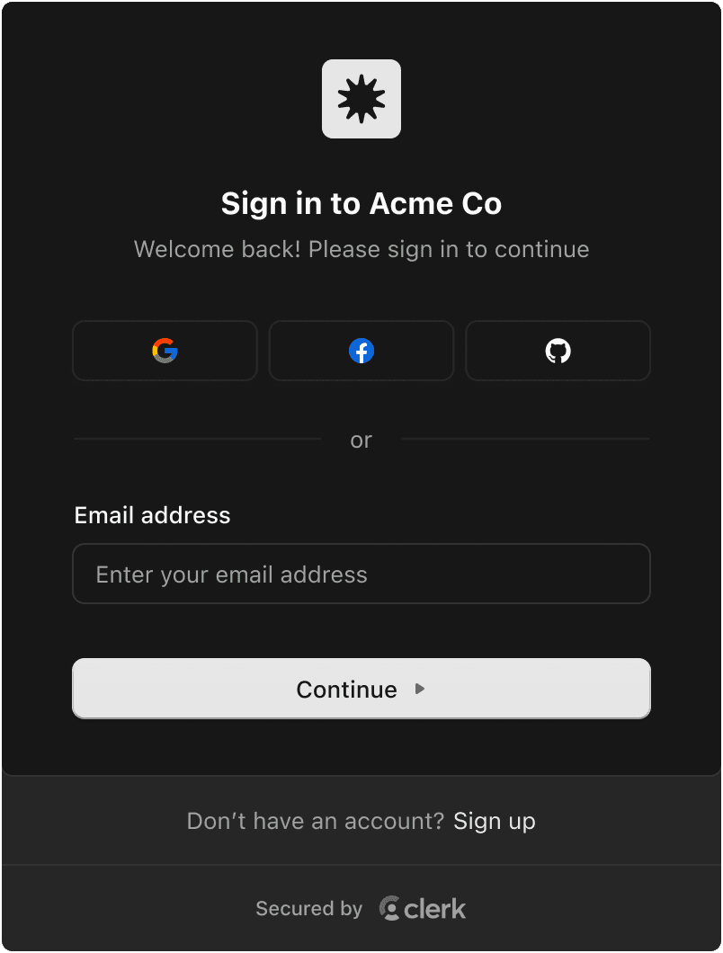
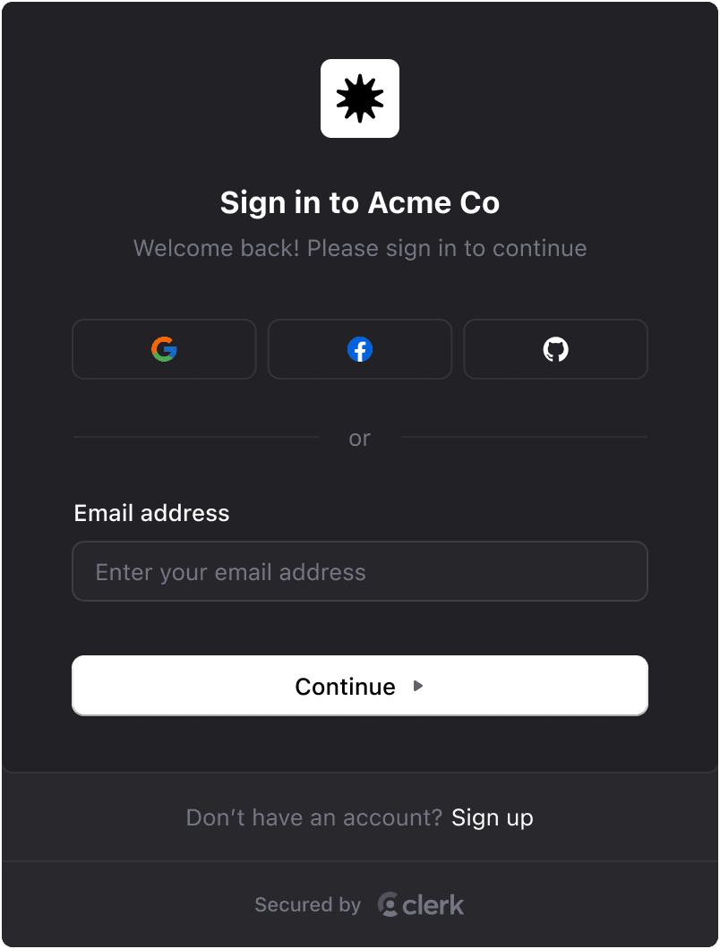
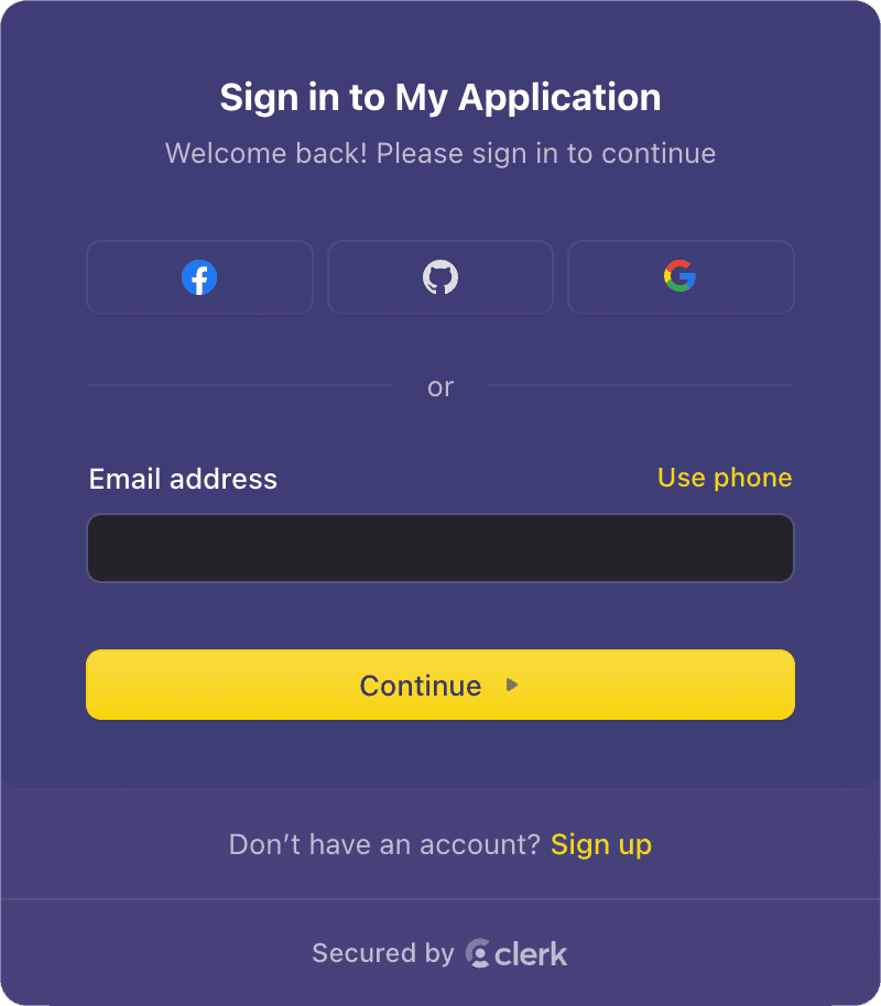
- The "Dark" theme
- The "Shades of Purple" theme
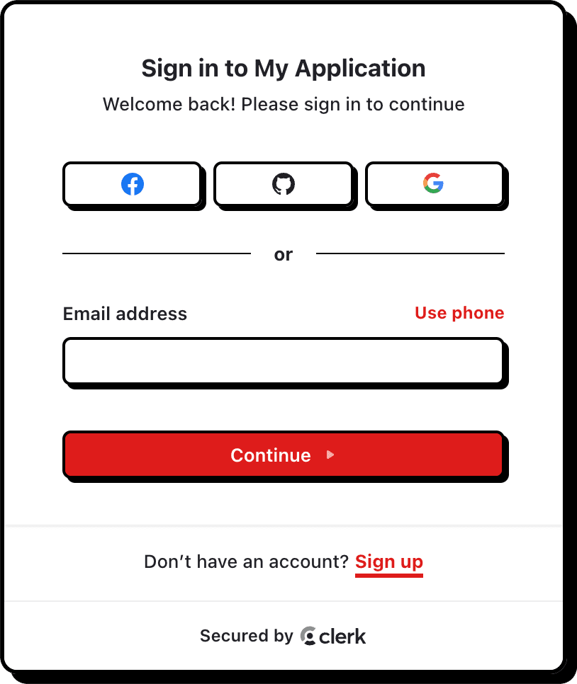
- The "Neobrutalism" theme
- The "Simple" theme
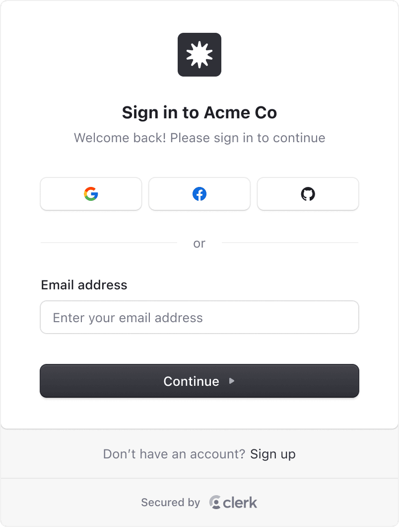
Default theme
Applied by default when no other theme is provided.
When using the shadcn/ui library, you can use the shadcn theme to apply the shadcn/ui styles to your Clerk components. This will adapt to both light and dark mode automatically.
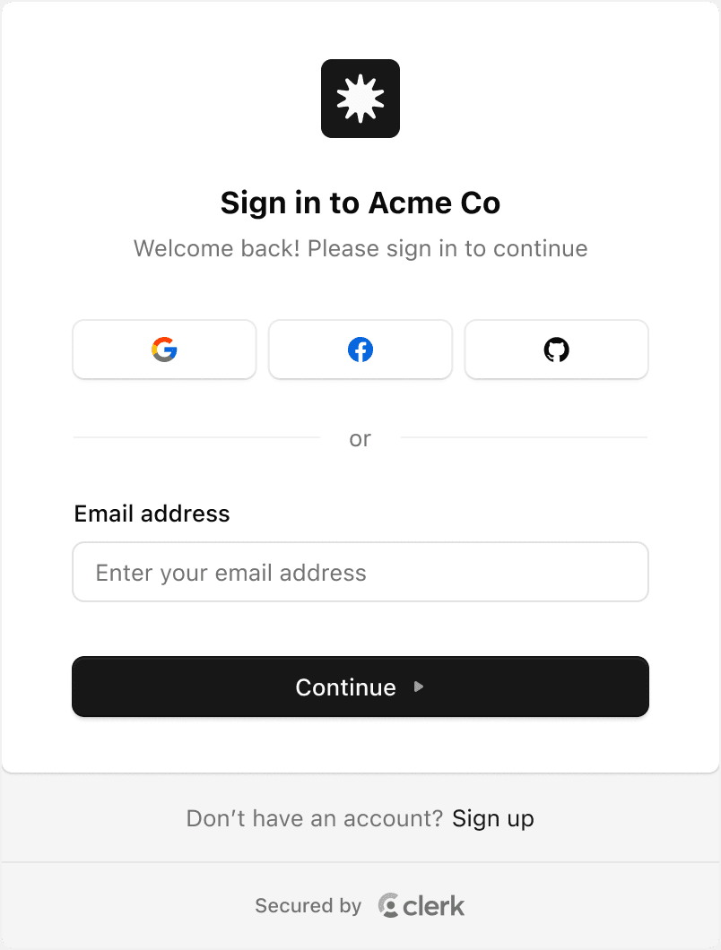
"Simple" theme
This theme is a stripped down "Default" theme that removes some more advanced styling techniques, making it easier to apply your own custom styles.
To use the simple theme, set theme to simple:
<ClerkProvider
  appearance={{
    theme: 'simple',
  }}
/>
Usage
-
To get started, install the
@clerk/themespackage.terminal npm install @clerk/themesterminal pnpm add @clerk/themesterminal yarn add @clerk/themesterminal bun add @clerk/themes -
To use a theme, import it from
@clerk/themesand pass it to theappearanceprop of a Clerk component.
Apply a theme to all Clerk components
To apply a theme to all Clerk components, pass the theme property to the appearance prop, which is available wherever you initialize the Clerk integration. For most SDKs, this is done via the <ClerkProvider> component. For other SDKs, it's configured through the SDK's Clerk integration or plugin.
In the following example, the "Dark" theme is applied to all Clerk components.
For React-based SDKs, pass the theme property to the appearance prop of the <ClerkProvider> component.
 import { dark } from '@clerk/themes'

 <ClerkProvider
  appearance={{
     theme: dark,
   }}
 >
   {/* ... */}
 </ClerkProvider>
In Astro, pass the theme property to the appearance prop of the clerk() integration.
import clerk from '@clerk/astro'
import { dark } from '@clerk/themes'

export default defineConfig({
  integrations: [
    clerk({
      appearance: {
        theme: dark,
      },
    }),
  ],
})
In JavaScript, pass the theme property to the appearance prop of the clerk.load() method.
Use the following tabs to view the code necessary for each file.
import { Clerk } from '@clerk/clerk-js'
import { dark } from '@clerk/themes'

const clerkPubKey = import.meta.env.VITE_CLERK_PUBLISHABLE_KEY

const clerk = new Clerk(clerkPubKey)
await clerk.load({
  appearance: {
    theme: dark,
  },
})

if (clerk.isSignedIn) {
  document.getElementById('app').innerHTML = `
      <div id="user-button"></div>
    `

  const userButtonDiv = document.getElementById('user-button')

  clerk.mountUserButton(userButtonDiv)
} else {
  document.getElementById('app').innerHTML = `
      <div id="sign-in"></div>
    `

  const signInDiv = document.getElementById('sign-in')

  clerk.mountSignIn(signInDiv)
}<!doctype html>
<html lang="en">
<head>
<meta charset="UTF-8" />
<link rel="icon" type="image/svg+xml" href="/vite.svg" />
<meta name="viewport" content="width=device-width, initial-scale=1.0" />
<title>Clerk + JavaScript App</title>
</head>
<body>
<div id="app"></div>
<script type="module" src="main.js" async crossorigin="anonymous"></script>
</body>
</html>In Vue, pass the theme property to the appearance prop of the clerkPlugin() integration.
import { createApp } from 'vue'
import App from './App.vue'
import { clerkPlugin } from '@clerk/vue'
import { dark } from '@clerk/themes'

const app = createApp(App)
app.use(clerkPlugin, {
  appearance: {
    theme: dark,
  },
})
app.mount('#app')
In Nuxt, pass the theme property to the appearance prop of the defineNuxtConfig() integration.
import { dark } from '@clerk/themes'

export default defineNuxtConfig({
  modules: ['@clerk/nuxt'],
  clerk: {
    appearance: {
      theme: dark,
    },
  },
})
In Fastify, pass the theme property to the appearance prop of the clerkPlugin() integration.
import Fastify from 'fastify'
import { clerkPlugin } from '@clerk/fastify'

const fastify = Fastify({ logger: true })

fastify.register(clerkPlugin, {
  appearance: {
    theme: dark,
  },
})
Apply multiple themes
You can also stack themes by passing an array of themes to the theme property of the appearance prop. The themes will be applied in the order they are listed. If styles overlap, the last defined theme will take precedence.
In the following example, the "Dark" theme is applied first, then the "Neobrutalism" theme is applied on top of it.
For React-based SDKs, pass the theme property to the appearance prop of the <ClerkProvider> component.
 import { dark, neobrutalism } from '@clerk/themes'

 <ClerkProvider
   appearance={{
     theme: [dark, neobrutalism],
   }}
 >
   {/* ... */}
 </ClerkProvider>
In Astro, pass the theme property to the appearance prop of the clerk() integration.
import clerk from '@clerk/astro'
import { dark, neobrutalism } from '@clerk/themes'

export default defineConfig({
  integrations: [
    clerk({
      appearance: {
        theme: [dark, neobrutalism],
      },
    }),
  ],
})
In JavaScript, pass the theme property to the appearance prop of the clerk.load() method.
Use the following tabs to view the code necessary for each file.
import { Clerk } from '@clerk/clerk-js'
import { dark, neobrutalism } from '@clerk/themes'

const clerkPubKey = import.meta.env.VITE_CLERK_PUBLISHABLE_KEY

const clerk = new Clerk(clerkPubKey)
await clerk.load({
  appearance: {
    theme: [dark, neobrutalism],
  },
})

if (clerk.isSignedIn) {
  document.getElementById('app').innerHTML = `
      <div id="user-button"></div>
    `

  const userButtonDiv = document.getElementById('user-button')

  clerk.mountUserButton(userButtonDiv)
} else {
  document.getElementById('app').innerHTML = `
      <div id="sign-in"></div>
    `

  const signInDiv = document.getElementById('sign-in')

  clerk.mountSignIn(signInDiv)
}<!doctype html>
<html lang="en">
<head>
<meta charset="UTF-8" />
<link rel="icon" type="image/svg+xml" href="/vite.svg" />
<meta name="viewport" content="width=device-width, initial-scale=1.0" />
<title>Clerk + JavaScript App</title>
</head>
<body>
<div id="app"></div>
<script type="module" src="main.js" async crossorigin="anonymous"></script>
</body>
</html>In Vue, pass the theme property to the appearance prop of the clerkPlugin() integration.
import { createApp } from 'vue'
import App from './App.vue'
import { clerkPlugin } from '@clerk/vue'
import { dark, neobrutalism } from '@clerk/themes'

const app = createApp(App)
app.use(clerkPlugin, {
  appearance: {
    theme: [dark, neobrutalism],
  },
})
app.mount('#app')
In Nuxt, pass the theme property to the appearance prop of the defineNuxtConfig() integration.
import { dark, neobrutalism } from '@clerk/themes'

export default defineNuxtConfig({
  modules: ['@clerk/nuxt'],
  clerk: {
    appearance: {
      theme: [dark, neobrutalism],
    },
  },
})
In Fastify, pass the theme property to the appearance prop of the clerkPlugin() integration.
import Fastify from 'fastify'
import { clerkPlugin } from '@clerk/fastify'

const fastify = Fastify({ logger: true })

fastify.register(clerkPlugin, {
  appearance: {
    theme: [dark, neobrutalism],
  },
})
Apply a theme to all instances of a Clerk component
You can apply a theme to all instances of a Clerk component by passing the component to the appearance prop, which is available wherever you initialize the Clerk integration. For most SDKs, this is done via the <ClerkProvider> component. For other SDKs, it's configured through the SDK's Clerk integration or plugin.
In the following example, the "Neobrutalism" theme is applied to all instances of the <SignIn /> component.
For React-based SDKs, pass the theme and signIn properties to the appearance prop of the <ClerkProvider> component.
import { dark, neobrutalism } from '@clerk/themes'

<ClerkProvider
  appearance={{
    theme: dark,
    signIn: { theme: neobrutalism },
  }}
>
  {/* ... */}
</ClerkProvider>
In Astro, pass the theme and signIn properties to the appearance prop of the clerk() integration.
import clerk from '@clerk/astro'
import { dark, neobrutalism } from '@clerk/themes'

export default defineConfig({
  integrations: [
    clerk({
      appearance: {
        theme: dark,
        signIn: { theme: neobrutalism },
      },
    }),
  ],
})
In JavaScript, pass the theme and signIn properties to the appearance prop of the clerk.load() method.
Use the following tabs to view the code necessary for each file.
import { Clerk } from '@clerk/clerk-js'
import { dark, neobrutalism } from '@clerk/themes'

const clerkPubKey = import.meta.env.VITE_CLERK_PUBLISHABLE_KEY

const clerk = new Clerk(clerkPubKey)
await clerk.load({
  appearance: {
    theme: dark,
    signIn: { theme: neobrutalism },
  },
})

if (clerk.isSignedIn) {
  document.getElementById('app').innerHTML = `
      <div id="user-button"></div>
    `

  const userButtonDiv = document.getElementById('user-button')

  clerk.mountUserButton(userButtonDiv)
} else {
  document.getElementById('app').innerHTML = `
      <div id="sign-in"></div>
    `

  const signInDiv = document.getElementById('sign-in')

  clerk.mountSignIn(signInDiv)
}<!doctype html>
<html lang="en">
<head>
<meta charset="UTF-8" />
<link rel="icon" type="image/svg+xml" href="/vite.svg" />
<meta name="viewport" content="width=device-width, initial-scale=1.0" />
<title>Clerk + JavaScript App</title>
</head>
<body>
<div id="app"></div>
<script type="module" src="main.js" async crossorigin="anonymous"></script>
</body>
</html>In Vue, pass the theme and signIn properties to the appearance prop of the clerkPlugin() integration.
import { createApp } from 'vue'
import App from './App.vue'
import { clerkPlugin } from '@clerk/vue'
import { dark, neobrutalism } from '@clerk/themes'

const app = createApp(App)
app.use(clerkPlugin, {
  appearance: {
    theme: dark,
    signIn: { theme: neobrutalism },
  },
})
app.mount('#app')
In Nuxt, pass the theme and signIn properties to the appearance prop of the defineNuxtConfig() integration.
import { dark, neobrutalism } from '@clerk/themes'

export default defineNuxtConfig({
  modules: ['@clerk/nuxt'],
  clerk: {
    appearance: {
      theme: dark,
      signIn: { theme: neobrutalism },
    },
  },
})
In Fastify, pass the theme and signIn properties to the appearance prop of the clerkPlugin() integration.
import Fastify from 'fastify'
import { clerkPlugin } from '@clerk/fastify'
import { dark, neobrutalism } from '@clerk/themes'

const fastify = Fastify({ logger: true })

fastify.register(clerkPlugin, {
  appearance: {
    theme: dark,
    signIn: { theme: neobrutalism },
  },
})
Apply a theme to a single Clerk component
To apply a theme to a single Clerk component, pass the appearance prop to the component. The appearance prop accepts the property theme, which can be set to a theme.
The following example is written for Next.js App Router but can be adapted for any React-based SDK.
import { SignIn } from '@clerk/nextjs'
import { dark } from '@clerk/themes'

export default function Page() {
  return (
    <SignIn
      appearance={{
        theme: dark,
      }}
    />
  )
}---
import { SignIn } from '@clerk/astro/components'
import { dark } from '@clerk/themes'
---
<SignIn
appearance={{
theme: dark,
}}
/><script setup lang="ts">
// Components are automatically imported
import { dark } from '@clerk/themes'
</script>
<template>
<SignIn :appearance="{ theme: dark }" />
</template><script setup lang="ts">
// Components are automatically imported
</script>
<template>
<SignIn :appearance="{ theme: dark }" />
</template>Customize a theme using variables
You can customize a theme by passing an object of variables to the variables property of the appearance prop. The variables property is used to adjust the general styles of the component's base theme, like colors, backgrounds, typography.
In the following example, the primary color of the themes are customized.
For React-based SDKs, pass the variables property to the appearance prop of the <ClerkProvider> component.
import { dark, neobrutalism, shadesOfPurple } from '@clerk/themes'

<ClerkProvider
  appearance={{
    theme: [dark, neobrutalism],
    variables: { colorPrimary: 'blue' },
    signIn: {
      theme: [shadesOfPurple],
      variables: { colorPrimary: 'green' },
    },
  }}
>
  {/* ... */}
</ClerkProvider>
In Astro, pass the variables property to the appearance prop of the clerk() integration.
import clerk from '@clerk/astro'
import { dark, neobrutalism, shadesOfPurple } from '@clerk/themes'

export default defineConfig({
  integrations: [
    clerk({
      appearance: {
        theme: [dark, neobrutalism],
        variables: { colorPrimary: 'blue' },
        signIn: {
          theme: [shadesOfPurple],
          variables: { colorPrimary: 'blue' },
        },
      },
    }),
  ],
})
In JavaScript, pass the variables property to the appearance prop of the clerk.load() method.
Use the following tabs to view the code necessary for each file.
import { Clerk } from '@clerk/clerk-js'
import { dark, neobrutalism, shadesOfPurple } from '@clerk/themes'

const clerkPubKey = import.meta.env.VITE_CLERK_PUBLISHABLE_KEY

const clerk = new Clerk(clerkPubKey)
await clerk.load({
  appearance: {
    theme: [dark, neobrutalism],
    variables: { colorPrimary: 'blue' },
    signIn: {
      theme: [shadesOfPurple],
      variables: { colorPrimary: 'blue' },
    },
  },
})

if (clerk.isSignedIn) {
  document.getElementById('app').innerHTML = `
      <div id="user-button"></div>
    `

  const userButtonDiv = document.getElementById('user-button')

  clerk.mountUserButton(userButtonDiv)
} else {
  document.getElementById('app').innerHTML = `
      <div id="sign-in"></div>
    `

  const signInDiv = document.getElementById('sign-in')

  clerk.mountSignIn(signInDiv)
}<!doctype html>
<html lang="en">
<head>
<meta charset="UTF-8" />
<link rel="icon" type="image/svg+xml" href="/vite.svg" />
<meta name="viewport" content="width=device-width, initial-scale=1.0" />
<title>Clerk + JavaScript App</title>
</head>
<body>
<div id="app"></div>
<script type="module" src="main.js" async crossorigin="anonymous"></script>
</body>
</html>In Vue, pass the variables property to the appearance prop of the clerkPlugin() integration.
import { createApp } from 'vue'
import App from './App.vue'
import { clerkPlugin } from '@clerk/vue'
import { dark, neobrutalism, shadesOfPurple } from '@clerk/themes'

const app = createApp(App)
app.use(clerkPlugin, {
  appearance: {
    theme: [dark, neobrutalism],
    variables: { colorPrimary: 'blue' },
    signIn: {
      theme: [shadesOfPurple],
      variables: { colorPrimary: 'blue' },
    },
  },
})
app.mount('#app')
In Nuxt, pass the variables property to the appearance prop of the defineNuxtConfig() integration.
import { dark, neobrutalism, shadesOfPurple } from '@clerk/themes'

export default defineNuxtConfig({
  modules: ['@clerk/nuxt'],
  clerk: {
    appearance: {
      theme: [dark, neobrutalism],
      variables: { colorPrimary: 'blue' },
      signIn: {
        theme: [shadesOfPurple],
        variables: { colorPrimary: 'blue' },
      },
    },
  },
})
In Fastify, pass the variables property to the appearance prop of the clerkPlugin() integration.
import Fastify from 'fastify'
import { clerkPlugin } from '@clerk/fastify'

const fastify = Fastify({ logger: true })

fastify.register(clerkPlugin, {
  appearance: {
    theme: [dark, neobrutalism],
    variables: { colorPrimary: 'blue' },
    signIn: {
      theme: [shadesOfPurple],
      variables: { colorPrimary: 'blue' },
    },
  },
})
Feedback
Last updated on