<UserButton /> component
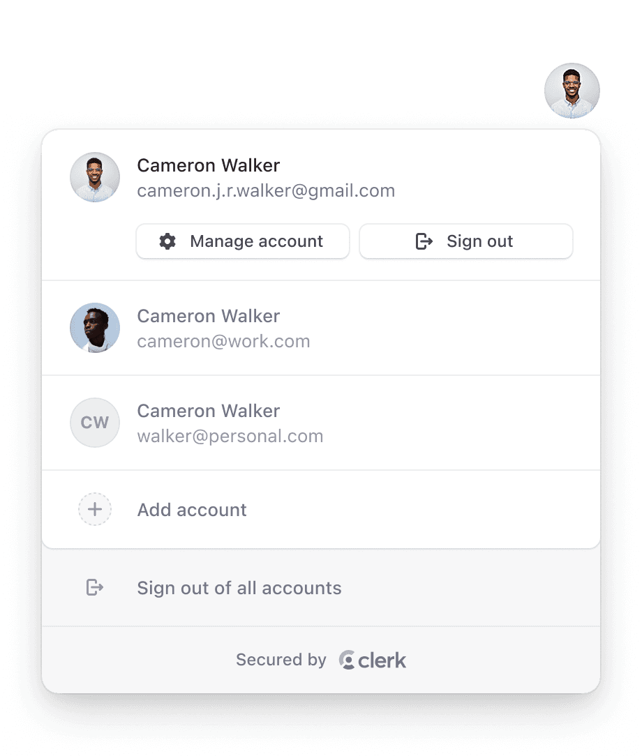
The <UserButton /> component renders the familiar user button UI popularized by Google. When selected, it opens a dropdown menu with options to manage account settings and sign out. The "Manage account" option launches the <UserProfile /> component, providing access to profile and security settings.
For users that have multi-session enabled, the <UserButton /> also allows users to sign into multiple accounts at once and instantly switch between them without the need for a full page reload. Learn more here.
Properties
The <UserButton /> component accepts the following properties, all of which are optional:
- Name
afterMultiSessionSingleSignOutUrl(deprecated)- Type
string- Description
Deprecated. Move
afterMultiSessionSingleSignOutUrlto<ClerkProvider />. The full URL or path to navigate to after signing out from a currently active account in a multi-session app.
- Name
afterSignOutUrl(deprecated)- Type
string- Description
Deprecated. Move
afterSignOutUrlto<ClerkProvider />. The full URL or path to navigate to after a successful sign-out.
- Name
afterSwitchSessionUrl- Type
string- Description
The full URL or path to navigate to after a successful account change in a multi-session app.
- Name
appearance- Type
Appearance | undefined- Description
Optional object to style your components. Will only affect Clerk components and not Account Portal pages.
- Name
defaultOpen- Type
boolean- Description
Controls whether the
<UserButton />should open by default during the first render.
- Name
showName- Type
boolean- Description
Controls if the user name is displayed next to the user image button.
- Name
signInUrl- Type
string- Description
The full URL or path to navigate to when the Add another account button is clicked. It's recommended to use the environment variable instead.
- Name
userProfileMode- Type
'modal' | 'navigation'- Description
Controls whether selecting the Manage your account button will cause the
<UserProfile />component to open as a modal, or if the browser will navigate to theuserProfileUrlwhere<UserProfile />is mounted as a page. Defaults to:'modal'.
- Name
userProfileProps- Type
object- Description
Specify options for the underlying
<UserProfile />component. For example:{additionalOAuthScopes: {google: ['foo', 'bar'], github: ['qux']}}.
- Name
userProfileUrl- Type
string- Description
The full URL or path leading to the user management interface.
- Name
fallback?- Type
ReactNode- Description
An optional element to be rendered while the component is mounting.
Usage with frameworks
In the following example, <UserButton /> is mounted inside a header component, which is a common pattern on many websites and applications. When the user is signed in, they will see their avatar and be able to open the popup menu.
import { ClerkProvider, SignedIn, SignedOut, SignInButton, UserButton } from '@clerk/nextjs'

function Header() {
  return (
    <header style={{ display: 'flex', justifyContent: 'space-between', padding: 20 }}>
      <h1>My App</h1>
      <SignedIn>
        <UserButton />
      </SignedIn>
      <SignedOut>
        <SignInButton />
      </SignedOut>
    </header>
  )
}

export default function RootLayout({ children }: { children: React.ReactNode }) {
  return (
    <html lang="en">
      <ClerkProvider>
        <Header />
        {children}
      </ClerkProvider>
    </html>
  )
}import { ClerkProvider, SignedIn, SignedOut, SignInButton, UserButton } from '@clerk/nextjs'
function Header() {
return (
<header style={{ display: 'flex', justifyContent: 'space-between', padding: 20 }}>
<h1>My App</h1>
<SignedIn>
<UserButton />
</SignedIn>
<SignedOut>
<SignInButton />
</SignedOut>
</header>
)
}
function MyApp({ pageProps }) {
return (
<ClerkProvider {...pageProps}>
<Header />
</ClerkProvider>
)
}
export default MyAppimport { SignedIn, UserButton, SignInButton, SignedOut } from '@clerk/clerk-react'
export default function App() {
return (
<header>
<SignedIn>
<UserButton />
</SignedIn>
<SignedOut>
<SignInButton />
</SignedOut>
</header>
)
}---
import { SignedIn, UserButton, SignInButton, SignedOut } from '@clerk/astro/components'
---
<SignedIn>
<UserButton />
</SignedIn>
<SignedOut>
<SignInButton />
</SignedOut>import { SignedIn, UserButton, SignInButton, SignedOut } from '@clerk/remix'
import { getAuth } from '@clerk/remix/ssr.server'
import { LoaderFunction, redirect } from '@remix-run/node'
export const loader: LoaderFunction = async (args) => {
const { userId } = await getAuth(args)
if (!userId) {
return redirect('/sign-in')
}
return {
props: {
userId,
},
}
}
export default function Index() {
return (
<header>
<SignedIn>
<UserButton />
</SignedIn>
<SignedOut>
<SignInButton />
</SignedOut>
</header>
)
}import { SignedIn, UserButton, SignInButton, SignedOut } from '@clerk/tanstack-react-start'
import { createFileRoute } from '@tanstack/react-router'
export const Route = createFileRoute('/')({
component: Home,
})
function Home() {
return (
<header>
<SignedIn>
<UserButton />
</SignedIn>
<SignedOut>
<SignInButton />
</SignedOut>
</header>
)
}<script setup>
import { SignedIn, UserButton, SignInButton, SignedOut } from '@clerk/vue'
</script>
<template>
<header>
<SignedIn>
<UserButton />
</SignedIn>
<SignedOut>
<SignInButton />
</SignedOut>
</header>
</template>Usage with JavaScript
The following methods available on an instance of the Clerk class are used to render and control the <UserButton /> component:
The following examples assume that you have followed the quickstart in order to add Clerk to your JavaScript application.
mountUserButton()
Render the <UserButton /> component to an HTML <div> element.
function mountUserButton(node: HTMLDivElement, props?: UserButtonProps): void- Name
node- Type
HTMLDivElement- Description
The
<div>element used to render in the<UserButton />component
- Name
props?- Type
UserButtonProps- Description
The properties to pass to the
<UserButton />component
import { Clerk } from '@clerk/clerk-js'

// Initialize Clerk with your Clerk Publishable Key
const clerkPubKey = import.meta.env.VITE_CLERK_PUBLISHABLE_KEY

const clerk = new Clerk(clerkPubKey)
await clerk.load()

document.getElementById('app').innerHTML = `
  <div id="user-button"></div>
`

const userbuttonDiv = document.getElementById('user-button')

clerk.mountUserButton(userbuttonDiv)
unmountUserButton()
Unmount and run cleanup on an existing <UserButton /> component instance.
function unmountUserButton(node: HTMLDivElement): void- Name
node- Type
HTMLDivElement- Description
The container
<div>element with a rendered<UserButton />component instance.
import { Clerk } from '@clerk/clerk-js'

// Initialize Clerk with your Clerk Publishable Key
const clerkPubKey = import.meta.env.VITE_CLERK_PUBLISHABLE_KEY

const clerk = new Clerk(clerkPubKey)
await clerk.load()

document.getElementById('app').innerHTML = `
  <div id="user-button"></div>
`

const userButtonDiv = document.getElementById('user-button')

clerk.mountUserButton(userButtonDiv)

// ...

clerk.unmountUserButton(userButtonDiv)
Customization
To learn about how to customize Clerk components, see the customization documentation.
You can also add custom actions and links to the <UserButton /> menu.
Feedback
Last updated on