<AuthView /> component
| iOS | Android |
|---|---|
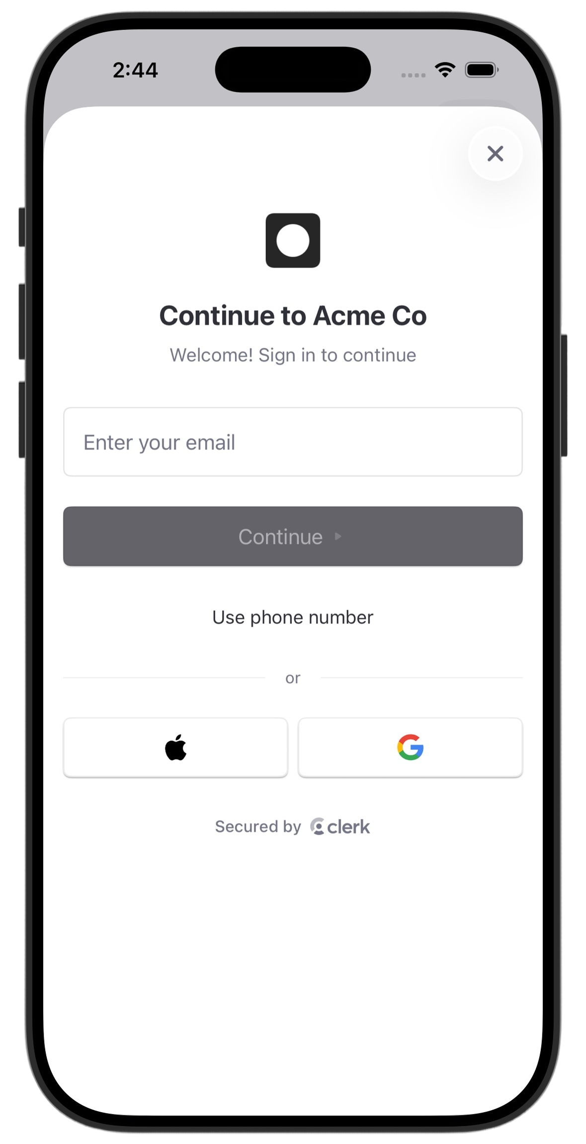 |  |
The <AuthView /> component renders a complete native authentication interface using SwiftUI on iOS and Jetpack Compose on Android. It handles all authentication flows including email, phone, OAuth, passkeys, and multi-factor authentication. All methods enabled in your Clerk Dashboard are automatically supported.
The <AuthView /> renders inline in your React Native view hierarchy, so you can place it in a modal, route, full-screen view, or any other layout that fits your app.
Usage
The following examples show how to use the <AuthView /> in your Expo app. You can use useAuth() or useUser() to read authentication state and update your UI after auth changes.
Render in a modal
The following example demonstrates one way to render <AuthView /> inside a React Native <Modal>. The native dismiss button is shown by default. Use onDismiss to close the modal in React Native state.
import { AuthView } from '@clerk/expo/native'
import { useAuth, useUser } from '@clerk/expo'
import { useState } from 'react'
import { Button, Modal, StyleSheet, Text, View } from 'react-native'

export default function AuthButton() {
  const { isSignedIn } = useAuth({ treatPendingAsSignedOut: false })
  const { user } = useUser()
  const [isAuthOpen, setIsAuthOpen] = useState(false)

  return (
    <View style={styles.container}>
      {isSignedIn ? (
        <Text>User ID: {user?.id}</Text>
      ) : (
        <Button title="Sign in" onPress={() => setIsAuthOpen(true)} />
      )}
      <Modal
        animationType="slide"
        visible={isAuthOpen}
        presentationStyle="pageSheet"
        onRequestClose={() => setIsAuthOpen(false)}
      >
        <AuthView onDismiss={() => setIsAuthOpen(false)} />
      </Modal>
    </View>
  )
}

const styles = StyleSheet.create({
  container: {
    flex: 1,
    justifyContent: 'center',
    alignItems: 'center',
  },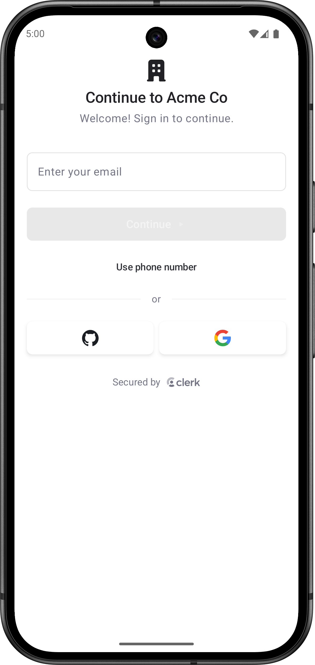
})<AuthView mode="signIn" /><AuthView mode="signUp" />Render as a required full-screen view
You can render <AuthView /> directly in a full-screen view when users must authenticate before continuing. In this case, pass isDismissible={false} so the native dismiss button isn't shown.
import { AuthView } from '@clerk/expo/native'
import { useSession } from '@clerk/expo'
import { useRouter } from 'expo-router'
import { useEffect } from 'react'

export default function SignInScreen() {
  const { session } = useSession()
  const router = useRouter()

  useEffect(() => {
    if (session?.status === 'active') {
      router.replace('/(home)')
    }
  }, [session?.status, router])

  return <AuthView isDismissible={false} />
}- Name
mode- Type
'signIn' | 'signUp' | 'signInOrUp'- Description
The authentication mode that determines which flows are available to the user. Defaults to
'signInOrUp'.'signIn'- Restricts the interface to sign-in flows only. Users can only authenticate with existing accounts.'signUp'- Restricts the interface to sign-up flows only. Users can only create new accounts.'signInOrUp'- Automatically determines whether to sign users in or sign them up based on whether they already have an account. This is the default mode that provides seamless authentication without requiring users to choose between sign-in and sign-up.
- Name
isDismissible- Type
boolean- Description
Whether the authentication view can be dismissed by the user. When
true, a dismiss button appears in the native navigation bar. Whenfalse, no dismiss button is shown. Defaults totrue.
- Name
onDismiss- Type
() => void- Description
A callback that runs when the native authentication view requests dismissal. Use this to update your app's presentation state, such as closing a React Native
<Modal>. UseuseAuth(),useUser(), oruseSession()to read auth state after authentication changes.
Social connection (OAuth) configuration
<AuthView /> automatically shows sign-in buttons for any social connections enabled in your Clerk Dashboard. However, native OAuth requires additional credential setup — without it, the buttons will appear but fail with an error when tapped.
Sign in with Google
Follow the steps in the Sign in with Google guide to complete the following:
- Enable Google as a social connection with Use custom credentials toggled on.
- Create OAuth 2.0 credentials in the Google Cloud Console — you'll need an iOS Client ID, Android Client ID, and Web Client ID.
- Set the Web Client ID and Client Secret in the Clerk Dashboard.
- Add your iOS application to the Native Applications page in the Clerk Dashboard (Team ID + Bundle ID).
- Add your Android application to the Native Applications page in the Clerk Dashboard (package name).
- Add the Google Client IDs as environment variables in your
.envfile. Follow the.env.examplein the Sign in with Google guide. - Configure the
@clerk/expoplugin with the iOS URL scheme in yourapp.json.
Sign in with Apple
Follow the steps in the Sign in with Apple guide to complete the following:
- Add your iOS application to the Native Applications page in the Clerk Dashboard (Team ID + Bundle ID).
- Enable Apple as a social connection in the Clerk Dashboard.
Feedback
Last updated on