ClerkTheme
The ClerkTheme is used to customize the appearance of Clerk Android views by adjusting colors, fonts, and design properties. It provides a comprehensive theming system that allows you to create a consistent visual experience across all Clerk views.
Structure
ClerkTheme consists of five main properties:
colors- Color properties for various UI elements across light and dark modes.lightColors- Optional overrides that only apply when the system is in light mode. These will default to thecolorsproperty if not provided.darkColors- Optional overrides that only apply when the system is in dark mode. These will default to thecolorsproperty if not provided.typography- Font and typography properties for different text styles.design- Design properties like border radius.
Colors
The colors,lightColors, and darkColors properties contain the following color options:
- Name
primary- Type
Color- Description
The primary color used throughout the views.
- Name
background- Type
Color- Description
The background color for containers.
- Name
input- Type
Color- Description
The background color used for input fields.
- Name
danger- Type
Color- Description
The color used for error states.
- Name
success- Type
Color- Description
The color used for success states.
- Name
warning- Type
Color- Description
The color used for warning states.
- Name
foreground- Type
Color- Description
The color used for text.
- Name
mutedForeground- Type
Color- Description
The color used for secondary text.
- Name
primaryForeground- Type
Color- Description
The color used for text on the primary background.
- Name
inputForeground- Type
Color- Description
The color used for text in input fields.
- Name
neutral- Type
Color- Description
The color that will be used to generate the neutral shades the views use.
- Name
ring- Type
Color- Description
The color of the ring when an interactive element is focused.
- Name
muted- Type
Color- Description
The color used for muted backgrounds.
- Name
shadow- Type
Color- Description
The base shadow color used in the views.
- Name
border- Type
Color- Description
The base border color used in the views.
Fonts
The typography property contains the following font options based on Android Dynamic Type:
- Name
displaySmall- Type
TextStyle- Description
- Name
headlineLarge- Type
TextStyle- Description
- Name
headlineMedium- Type
TextStyle- Description
- Name
titleMedium- Type
TextStyle- Description
- Name
titleSmall- Type
TextStyle- Description
- Name
bodyLarge- Type
TextStyle- Description
- Name
bodyMedium- Type
TextStyle- Description
- Name
bodySmall- Type
TextStyle- Description
- Name
labelMedium- Type
TextStyle- Description
- Name
labelSmall- Type
TextStyle- Description
Design
The design property contains the following design options:
- Name
borderRadius- Type
Dp- Description
The border radius used throughout the views. By default, this is set to
8.0.
Usage
You can customize Clerk Android views by creating a ClerkTheme and applying it to Clerk's customTheme setter.
Apply a custom theme to all Clerk views
To customize all Clerk views in your app, create a ClerkTheme and apply it where you initialize the Clerk SDK.
import android.app.Application
import com.clerk.api.Clerk
import androidx.compose.ui.graphics.Color
import androidx.compose.ui.unit.dp
import androidx.compose.ui.unit.sp
import com.clerk.api.ui.ClerkColors
import com.clerk.api.ui.ClerkDesign
import com.clerk.api.ui.ClerkTheme
import com.clerk.api.ui.ClerkTypography
import com.clerk.api.ui.ClerkTypographyDefaults

class WorkbenchApplication : Application() {

  override fun onCreate() {
    super.onCreate()
    val theme = ClerkTheme(
      colors = ClerkColors(primary = Color.Blue),
      design = ClerkDesign(borderRadius = 24.dp),
      typography = ClerkTypography(displaySmall = ClerkTypographyDefaults.displaySmall.copy(fontSize = 24.sp))
    )

    Clerk.initialize(this, "YOUR_PUBLISHABLE_KEY", theme = theme)
  }
}
Apply a theme to specific views
You can apply a theme to specific Clerk views by passing a ClerkTheme to any Clerk UI component. The theme used here will apply to all children of this view.
import androidx.compose.runtime.Composable
import androidx.compose.ui.Modifier
import androidx.compose.ui.graphics.Color
import androidx.compose.ui.Alignment
import androidx.compose.foundation.layout.Box
import androidx.compose.foundation.layout.fillMaxSize
import androidx.compose.foundation.background
import androidx.compose.runtime.getValue
import androidx.lifecycle.compose.collectAsStateWithLifecycle
import com.clerk.api.Clerk
import com.clerk.api.ui.ClerkColors
import com.clerk.api.ui.ClerkTheme
import com.clerk.ui.auth.AuthView
import com.clerk.ui.userbutton.UserButton

@Composable
fun HomeScreen() {
    val user by Clerk.userFlow.collectAsStateWithLifecycle()
    Box(
        modifier = Modifier.fillMaxSize().background(color = Color(0xFFF9F9F9)),
        contentAlignment = Alignment.Center,
    ) {
        if (user != null) {
            UserButton()
        } else {
            AuthView(clerkTheme = ClerkTheme(colors = ClerkColors(primary = Color.Blue)))
        }
    }
}
Adjust a specific property of the theme
You can adjust a specific property of the theme by modifying a single property.
import com.clerk.api.ui.ClerkColors
import com.clerk.api.ui.ClerkTheme
import androidx.compose.ui.graphics.Color
import androidx.compose.runtime.Composable
import com.clerk.ui.auth.AuthView

@Composable
fun SignInView() {
    AuthView(clerkTheme = ClerkTheme(colors = ClerkColors(primary = Color.Blue)))
}
Custom fonts
You can customize fonts by modifying the typography property of the ClerkTheme.
Using a font family name
val fontFamily = FontFamily(Font(R.font.custom_font))

AuthView(clerkTheme = ClerkTheme(typography = ClerkTypography(displaySmall = ClerkTypographyDefaults.displaySmall.copy(fontSize = 24.sp, fontFamily = fontFamily))))
Light and dark mode support
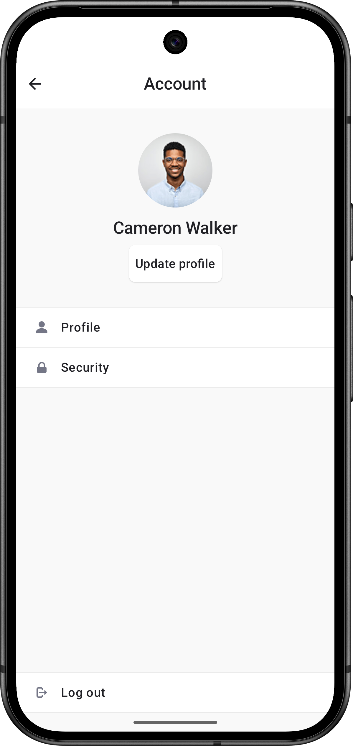
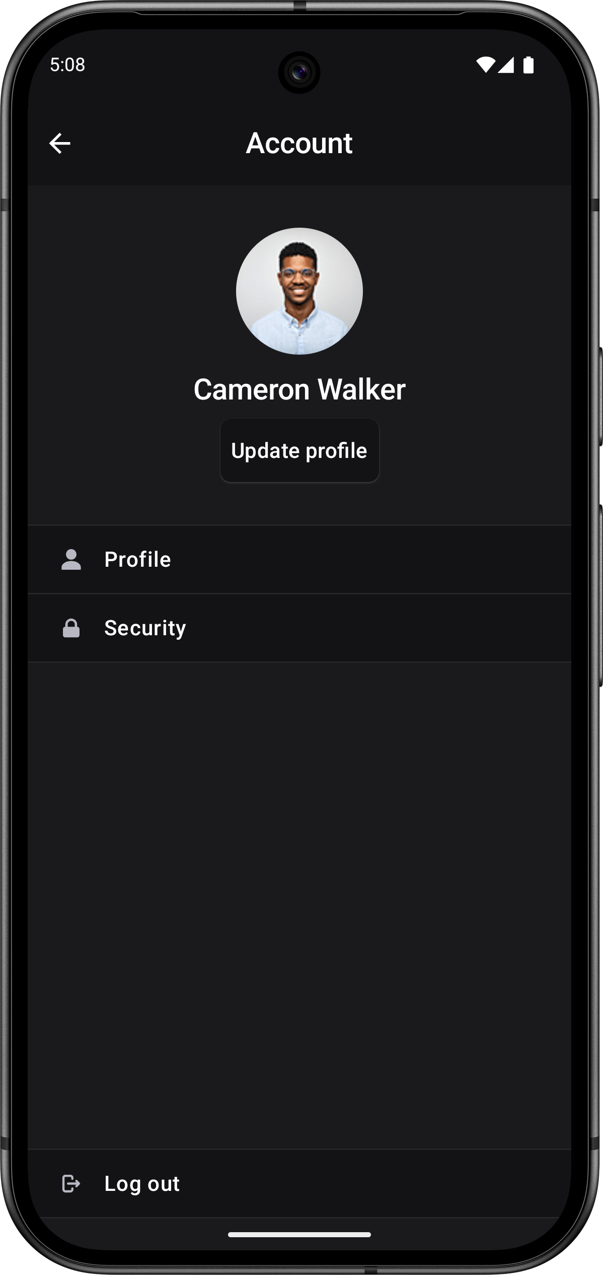
Clerk Android views automatically support both light and dark mode appearance, adapting seamlessly to the user's system preferences.
If Clerk's prebuilt theming doesn't meet your specific needs, you can create completely custom authentication flows using the Clerk API. See the SDK docs.
Feedback
Last updated on