UserButton
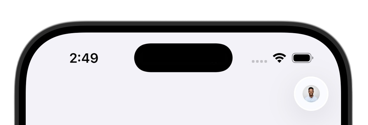
The UserButton is a circular button that displays the user's profile image. When tapped, it presents a sheet with the UserProfileView.
- Name
signedOutContent- Type
@ViewBuilder () -> SignedOutContent- Description
A view builder that renders when no user is signed in. Defaults to
EmptyView, which renders nothing.
import SwiftUI
import ClerkKit
import ClerkKitUI

struct HomeView: View {
  @State private var authViewIsPresented = false

  var body: some View {
    VStack {
      UserButton(signedOutContent: {
        Button("Sign in") {
          authViewIsPresented = true
        }
      })
    }
    .prefetchClerkImages()
    .sheet(isPresented: $authViewIsPresented) {
      AuthView()
    }
  }
}import SwiftUI
import ClerkKit
import ClerkKitUI
struct ContentView: View {
@State private var authViewIsPresented = false
var body: some View {
NavigationView {
VStack {
Text("Welcome!")
}
.toolbar {
ToolbarItem(placement: .navigationBarTrailing) {
UserButton(signedOutContent: {
Button("Sign in") {
authViewIsPresented = true
}
})
}
}
}
.prefetchClerkImages()
.sheet(isPresented: $authViewIsPresented) {
AuthView()
}
}
}Customization
To learn how to customize Clerk views, see the dedicated guide.
If Clerk's prebuilt views don't meet your specific needs or if you require more control over the logic, you can rebuild the existing Clerk flows using the Clerk API. For more information, see the custom flow guides.
Feedback
Last updated on