Themes

Clerk currently offers six prebuilt themes for you to customize the overall appearance of your Clerk application.
Installation
-
To get started, install the
@clerk/uipackage.npm install @clerk/uipnpm add @clerk/uiyarn add @clerk/uibun add @clerk/ui -
To use a theme, import it from
@clerk/uiand apply it using the appearance prop.
Usage
You can apply themes at different levels depending on your needs:
- Across all Clerk components
- All instances of a Clerk component
- A single Clerk component
For more customization options, refer to the Advanced usage section.
Apply a theme to all Clerk components
To apply a theme to all Clerk components, pass the appearance prop to the clerk.load() method. The appearance prop accepts the property theme, which can be set to a theme.
In the following example, the "Dark" theme is applied to all Clerk components.
Use the following tabs to view the code necessary for each file.
import { Clerk } from '@clerk/clerk-js'
import { dark } from '@clerk/ui/themes'

const clerkPubKey = import.meta.env.VITE_CLERK_PUBLISHABLE_KEY

const clerk = new Clerk(clerkPubKey)
await clerk.load({
  appearance: {
    theme: dark,
  },
})

if (clerk.isSignedIn) {
  document.getElementById('app').innerHTML = `
      <div id="user-button"></div>
    `

  const userButtonDiv = document.getElementById('user-button')

  clerk.mountUserButton(userButtonDiv)
} else {
  document.getElementById('app').innerHTML = `
      <div id="sign-in"></div>
    `

  const signInDiv = document.getElementById('sign-in')

  clerk.mountSignIn(signInDiv)
}<!doctype html>
<html lang="en">
<head>
<meta charset="UTF-8" />
<link rel="icon" type="image/svg+xml" href="/vite.svg" />
<meta name="viewport" content="width=device-width, initial-scale=1.0" />
<title>Clerk + JavaScript App</title>
</head>
<body>
<div id="app"></div>
<script type="module" src="main.js" async crossorigin="anonymous"></script>
</body>
</html>Apply a theme to all instances of a Clerk component
To apply a theme to all instances of a Clerk component, you can pass the name of the Clerk component itself to the appearance prop.
In the following example, the "Neobrutalism" theme is applied to all instances of the <SignIn /> component.
Use the following tabs to view the code necessary for each file.
import { Clerk } from '@clerk/clerk-js'
import { dark, neobrutalism } from '@clerk/ui/themes'

const clerkPubKey = import.meta.env.VITE_CLERK_PUBLISHABLE_KEY

const clerk = new Clerk(clerkPubKey)
await clerk.load({
  appearance: {
    theme: dark,
    signIn: { theme: neobrutalism },
  },
})

if (clerk.isSignedIn) {
  document.getElementById('app').innerHTML = `
      <div id="user-button"></div>
    `

  const userButtonDiv = document.getElementById('user-button')

  clerk.mountUserButton(userButtonDiv)
} else {
  document.getElementById('app').innerHTML = `
      <div id="sign-in"></div>
    `

  const signInDiv = document.getElementById('sign-in')

  clerk.mountSignIn(signInDiv)
}<!doctype html>
<html lang="en">
<head>
<meta charset="UTF-8" />
<link rel="icon" type="image/svg+xml" href="/vite.svg" />
<meta name="viewport" content="width=device-width, initial-scale=1.0" />
<title>Clerk + JavaScript App</title>
</head>
<body>
<div id="app"></div>
<script type="module" src="main.js" async crossorigin="anonymous"></script>
</body>
</html>Apply a theme to a single Clerk component
To apply a theme to a single Clerk component, pass the theme property to the appearance prop of the Clerk component.
In the following example, the "Dark" theme is applied to the <SignIn /> component.
<SignIn
  appearance={{
    theme: dark,
  }}
/>
Advanced usage
Apply multiple themes
You can also stack themes by passing an array of themes to the theme property of the appearance prop. The themes will be applied in the order they are listed. If styles overlap, the last defined theme will take precedence.
In the following example, the "Dark" theme is applied first, then the "Neobrutalism" theme is applied on top of it.
Use the following tabs to view the code necessary for each file.
import { Clerk } from '@clerk/clerk-js'
import { dark, neobrutalism } from '@clerk/ui/themes'

const clerkPubKey = import.meta.env.VITE_CLERK_PUBLISHABLE_KEY

const clerk = new Clerk(clerkPubKey)
await clerk.load({
  appearance: {
    theme: [dark, neobrutalism],
  },
})

if (clerk.isSignedIn) {
  document.getElementById('app').innerHTML = `
      <div id="user-button"></div>
    `

  const userButtonDiv = document.getElementById('user-button')

  clerk.mountUserButton(userButtonDiv)
} else {
  document.getElementById('app').innerHTML = `
      <div id="sign-in"></div>
    `

  const signInDiv = document.getElementById('sign-in')

  clerk.mountSignIn(signInDiv)
}<!doctype html>
<html lang="en">
<head>
<meta charset="UTF-8" />
<link rel="icon" type="image/svg+xml" href="/vite.svg" />
<meta name="viewport" content="width=device-width, initial-scale=1.0" />
<title>Clerk + JavaScript App</title>
</head>
<body>
<div id="app"></div>
<script type="module" src="main.js" async crossorigin="anonymous"></script>
</body>
</html>Customize a theme using variables
You can customize a theme by passing an object of variables to the variables property of the appearance prop. The variables property is used to adjust the general styles of the component's base theme, like colors, backgrounds, typography.
In the following example, the primary color of the themes are customized.
Use the following tabs to view the code necessary for each file.
import { Clerk } from '@clerk/clerk-js'
import { dark, neobrutalism, shadesOfPurple } from '@clerk/ui/themes'

const clerkPubKey = import.meta.env.VITE_CLERK_PUBLISHABLE_KEY

const clerk = new Clerk(clerkPubKey)
await clerk.load({
  appearance: {
    theme: [dark, neobrutalism],
    variables: { colorPrimary: 'blue' },
    signIn: {
      theme: [shadesOfPurple],
      variables: { colorPrimary: 'blue' },
    },
  },
})

if (clerk.isSignedIn) {
  document.getElementById('app').innerHTML = `
      <div id="user-button"></div>
    `

  const userButtonDiv = document.getElementById('user-button')

  clerk.mountUserButton(userButtonDiv)
} else {
  document.getElementById('app').innerHTML = `
      <div id="sign-in"></div>
    `

  const signInDiv = document.getElementById('sign-in')

  clerk.mountSignIn(signInDiv)
}<!doctype html>
<html lang="en">
<head>
<meta charset="UTF-8" />
<link rel="icon" type="image/svg+xml" href="/vite.svg" />
<meta name="viewport" content="width=device-width, initial-scale=1.0" />
<title>Clerk + JavaScript App</title>
</head>
<body>
<div id="app"></div>
<script type="module" src="main.js" async crossorigin="anonymous"></script>
</body>
</html>Available themes
Clerk provides six prebuilt themes:
- The default theme
- The "Simple" theme
- The "shadcn" theme
- The "Dark" theme
- The "Shades of Purple" theme
- The "Neobrutalism" theme
To explore how each theme looks before integrating it into your application, use the Clerk's theme editor, which lets you preview and experiment with themes in real time.
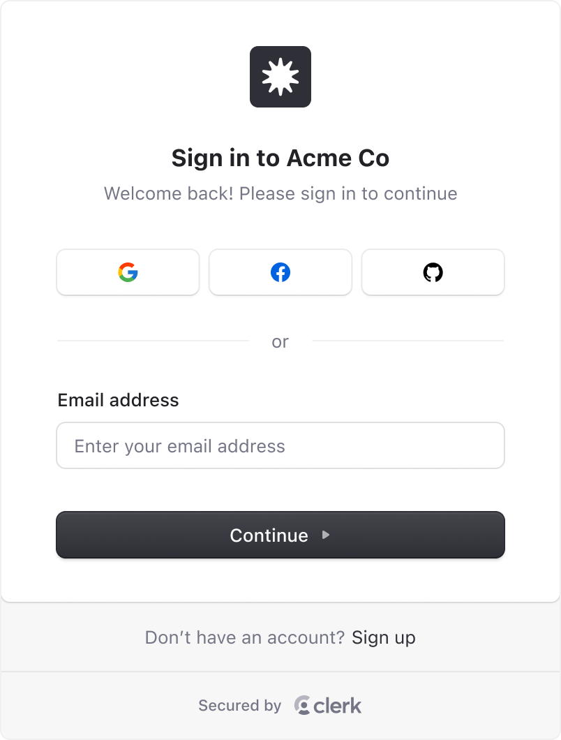
Default theme
Applied by default when no other theme is provided. The default theme supports both light and dark modes, with light mode displaying by default unless a color-scheme is defined. To enable dark mode support, you need to set the color-scheme property in your global.css file.
To enable both light and dark mode support (which will respect system preferences), set color-scheme to light dark:
:root {
  color-scheme: light dark;
}
You can also control dark mode via a class, data attribute, or media query by specifying color-scheme: dark in your global.css file:
:root {
  color-scheme: light;
}

/* Using a class */
.dark {
  color-scheme: dark;
}

/* Using a data attribute */
[data-theme='dark'] {
  color-scheme: dark;
}

/* Using a media query (respects system preferences) */
@media (prefers-color-scheme: dark) {
  :root {
    color-scheme: dark;
  }
}
"Simple" theme
This theme is a stripped down "Default" theme that removes some more advanced styling techniques, making it easier to apply your own custom styles.
To use the simple theme, set theme to simple:
<ClerkProvider
  appearance={{
    theme: 'simple',
  }}
/>
"shadcn" theme
To use the shadcn theme, set theme to shadcn:
import { shadcn } from '@clerk/ui/themes'

<ClerkProvider
  appearance={{
    theme: shadcn,
  }}
/>When using the shadcn/ui library, you can use the shadcn theme to apply the shadcn/ui styles to your Clerk components. This will adapt to both light and dark mode automatically.
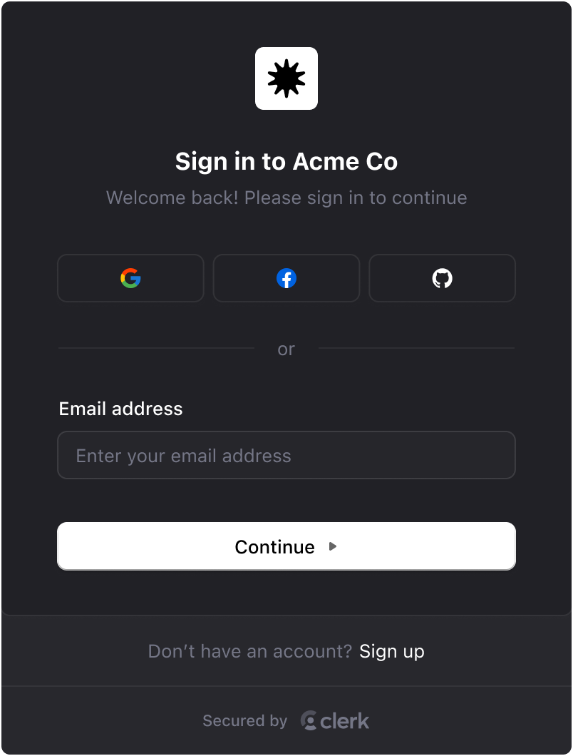
"Dark" theme
To use the dark theme, set theme to dark:
import { dark } from '@clerk/ui/themes'
<ClerkProvider
appearance={{
theme: dark,
}}
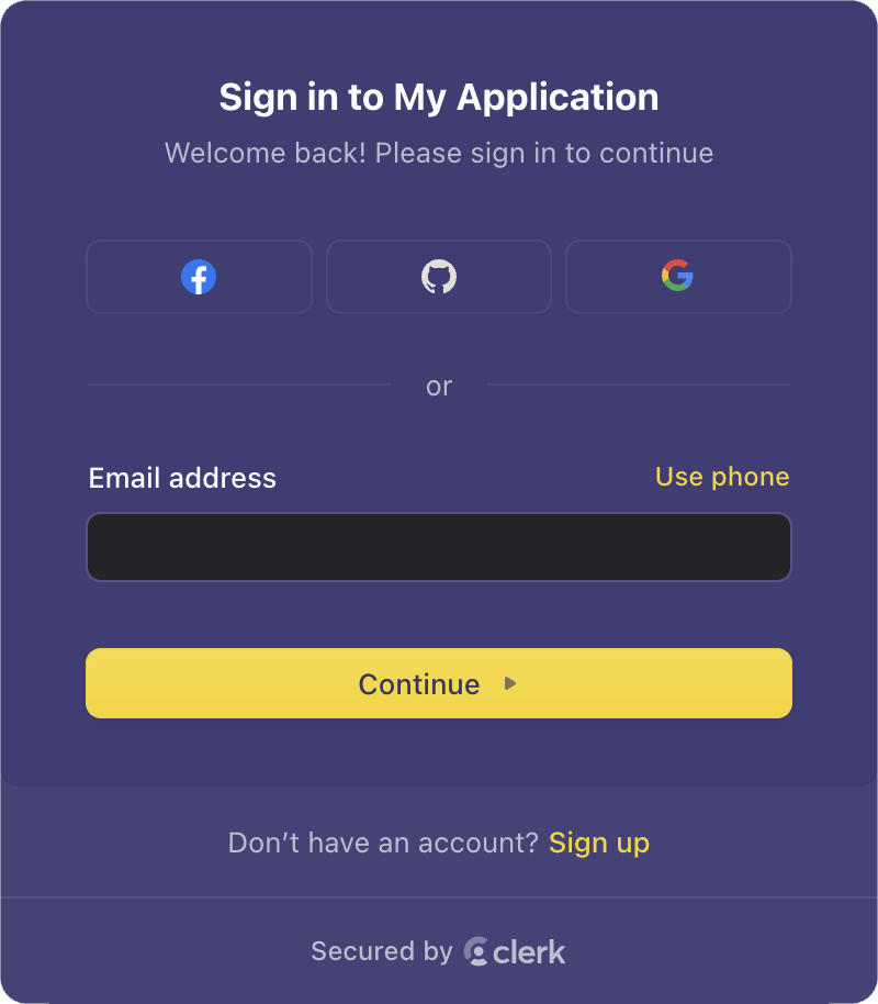
/>"Shades of purple" theme
To use the shades of purple theme, set theme to shadesOfPurple:
import { shadesOfPurple } from '@clerk/ui/themes'

<ClerkProvider
  appearance={{
    theme: shadesOfPurple,
  }}
/>
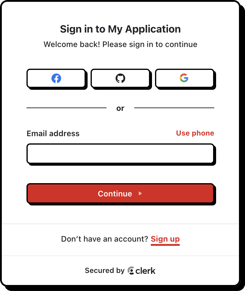
"Neobrutalism" theme
To use the neobrutalism theme, set theme to neobrutalism:
import { neobrutalism } from '@clerk/ui/themes'

<ClerkProvider
  appearance={{
    theme: neobrutalism,
  }}
/>
Feedback
Last updated on