<UserButton />
| iOS | Android |
|---|---|
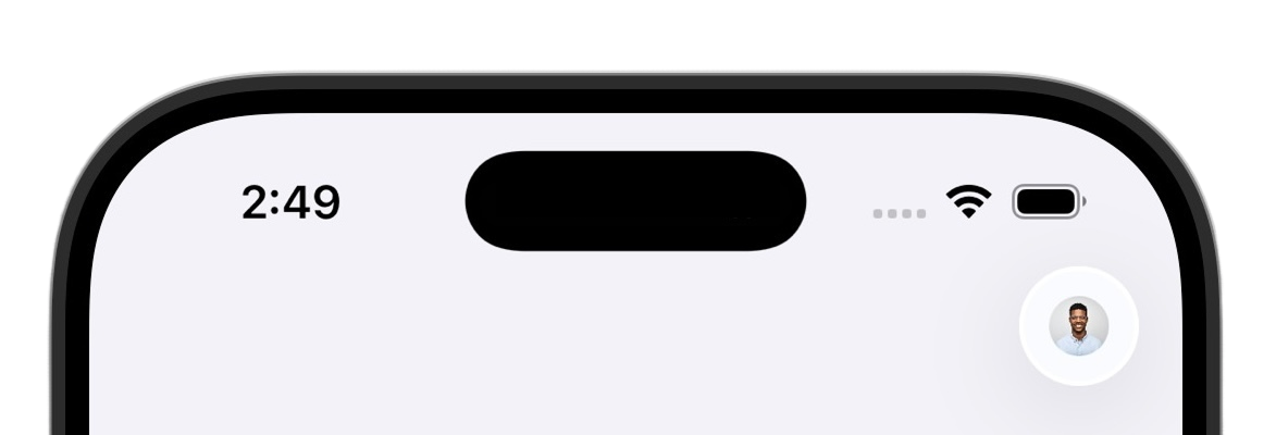 | 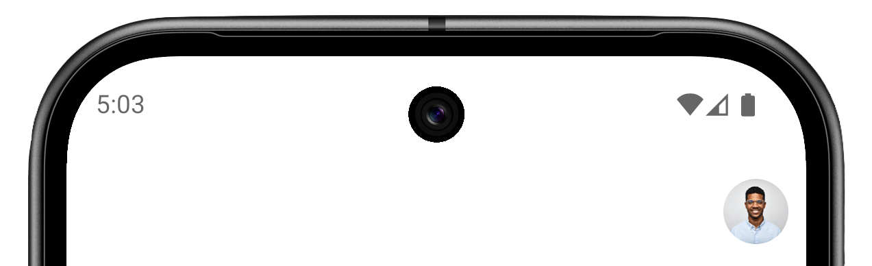 |
The <UserButton /> component renders the platform-native Clerk user button. It displays the user's profile image or initials, and when tapped, it opens <UserProfileView />.
Requirements
In addition to these requirements, this component requires the user to be signed in. The following example demonstrates how to use the <Show> component to check if the user is signed in and render the <UserButton /> or a Sign in button accordingly.
import { Show } from '@clerk/expo'
import { AuthView, UserButton } from '@clerk/expo/native'
import { useState } from 'react'
import { Button, Modal, StyleSheet, View } from 'react-native'

export default function Screen() {
  const [isAuthOpen, setIsAuthOpen] = useState(false)

  return (
    <View style={styles.container}>
      <Show when="signed-in">
        <UserButton />
      </Show>
      <Show when="signed-out">
        <Button title="Sign in" onPress={() => setIsAuthOpen(true)} />
      </Show>
      <Modal
        animationType="slide"
        visible={isAuthOpen}
        presentationStyle="pageSheet"
        onRequestClose={() => setIsAuthOpen(false)}
      >
        <AuthView onDismiss={() => setIsAuthOpen(false)} />
      </Modal>
    </View>
  )
}

const styles = StyleSheet.create({
  container: {
    flex: 1,
    justifyContent: 'center',
    alignItems: 'center',
  },
})import { View, Text } from 'react-native'
import { UserButton } from '@clerk/expo/native'
import { useUser } from '@clerk/expo'
export default function HomeScreen() {
const { user } = useUser()
return (
<View style={{ flex: 1, padding: 20 }}>
<View style={{ flexDirection: 'row', justifyContent: 'space-between', alignItems: 'center' }}>
<Text style={{ fontSize: 24 }}>User ID: {user?.id}</Text>
<UserButton />
</View>
</View>
)
}In a header
The following example configures the header for screens in the (home) route group. Make sure the route group contains an index.tsx route.
import { View } from 'react-native'
import { Stack } from 'expo-router'
import { UserButton } from '@clerk/expo/native'

export default function HomeLayout() {
  return (
    <Stack
      screenOptions={{
        headerRight: () => (
          <View style={{ marginRight: 16 }}>
            <UserButton />
          </View>
        ),
      }}
    >
      <Stack.Screen name="index" options={{ title: 'Home' }} />
    </Stack>
  )
}
Properties
The <UserButton /> component does not accept any props. It renders the avatar and opens <UserProfileView />.
Platform support
Feedback
Last updated on