AuthView
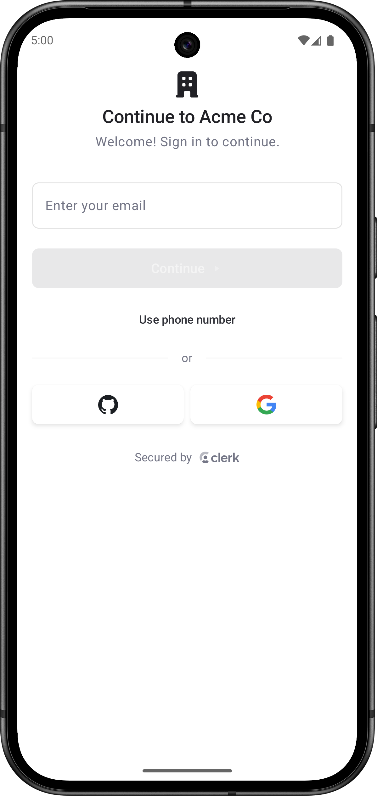
The AuthView renders a comprehensive authentication interface with support for multiple sign-up flows and sign-in methods, multi-factor authentication, password reset, and account recovery. The functionality of the AuthView is controlled by the instance settings you specify in the Clerk Dashboard, such as sign-in and sign-up options and social connections.
By default, the AuthView will automatically determine whether to sign users in or sign them up based on whether they already have an account. This is the default mode that provides seamless authentication without requiring users to choose between sign-in and sign-up.
Parameters
- Name
modifier- Type
Modifier- Description
A modifier that gets applied to the top-level container of the
AuthView. It shouldn't be used to change the appearance of theAuthViewitself.
- Name
clerkTheme- Type
ClerkTheme?- Description
The theme to apply to the
AuthView.
- Name
initialIdentifier- Type
String?- Description
The initial value for the identifier field. Phone-like values are routed to the phone number field automatically.
- Name
persistIdentifiers- Type
Boolean- Description
Whether stored auth-start identifiers should persist between auth attempts. Defaults to
true.
- Name
preferGoogleOneTap- Type
Boolean- Description
Whether Google social authentication uses native Google One Tap when it's configured. When
false, Google social authentication always uses browser OAuth. Defaults totrue.
- Name
startSocialOAuthAsSignUp- Type
Boolean- Description
Whether browser OAuth social authentication starts from a sign-up attempt and transfers back to sign-in if the selected account already exists. Defaults to
false.
- Name
unsafeMetadata- Type
Map<String, Any>?- Description
Custom metadata to attach to users created by the prebuilt sign-up flow. This metadata isn't validated by Clerk and shouldn't contain sensitive information.
- Name
isDismissible- Type
Boolean- Description
Whether the auth start screen shows a dismiss affordance. When
true, the user can dismiss the view from the auth start screen. Defaults totrue.
- Name
onDismiss- Type
(() -> Unit)?- Description
Called when the user presses the dismiss affordance. When omitted, dismissal falls back to the system back dispatcher.
- Name
onAuthComplete- Type
() -> Unit- Description
Called when authentication completes.
The following example shows how to use the AuthView in your Android app.
Basic usage
import androidx.compose.foundation.layout.Box
import androidx.compose.foundation.layout.fillMaxSize
import androidx.compose.runtime.Composable
import androidx.compose.runtime.getValue
import androidx.compose.ui.Alignment
import androidx.compose.ui.Modifier
import androidx.lifecycle.compose.collectAsStateWithLifecycle
import com.clerk.api.Clerk
import com.clerk.ui.auth.AuthView
import com.clerk.ui.userbutton.UserButton

@Composable
fun HomeScreen() {
    val user by Clerk.userFlow.collectAsStateWithLifecycle()
    Box(modifier = Modifier.fillMaxSize(), contentAlignment = Alignment.Center) {
        if (user != null) {
            UserButton()
        } else {
            AuthView()
        }
    }
}
Non-dismissible auth
Use isDismissible = false when the auth flow is the required fullscreen experience for the current route.
import com.clerk.ui.auth.AuthView

AuthView(isDismissible = false)
Custom dismiss handling
Provide an onDismiss callback to handle dismissal yourself, such as to navigate away from the auth screen.
import com.clerk.ui.auth.AuthView

AuthView(
    isDismissible = true,
    onDismiss = {
        // Navigate away from the auth screen.
    },
)
Customization
To learn how to customize Clerk views, see the dedicated guide.
If Clerk's prebuilt views don't meet your specific needs or if you require more control over the logic, you can rebuild the existing Clerk flows using the Clerk API. For more information, see the custom flow guides.
Feedback
Last updated on