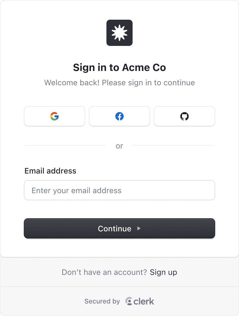
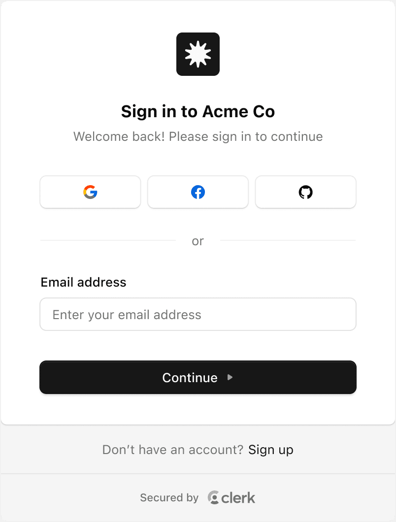
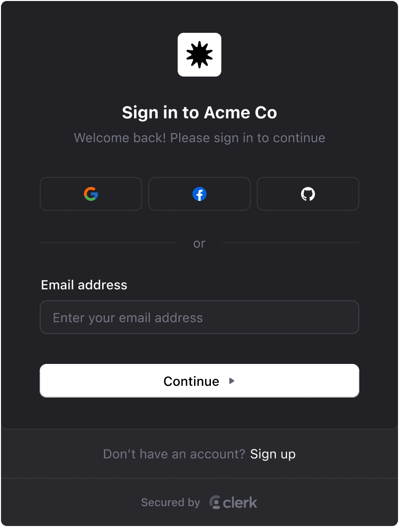
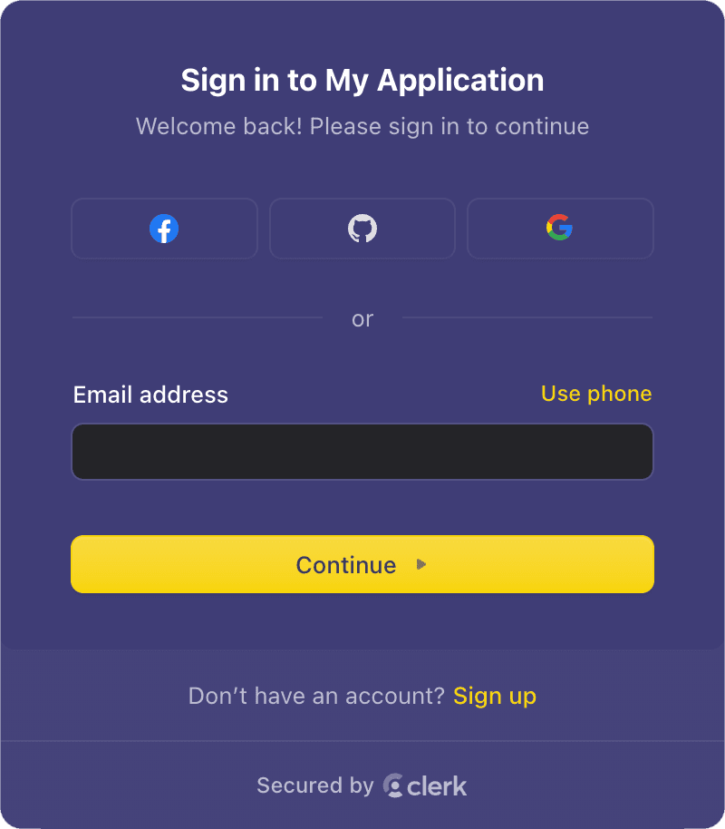
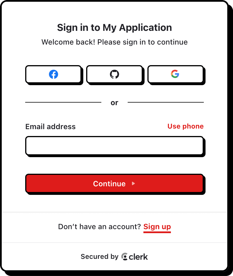
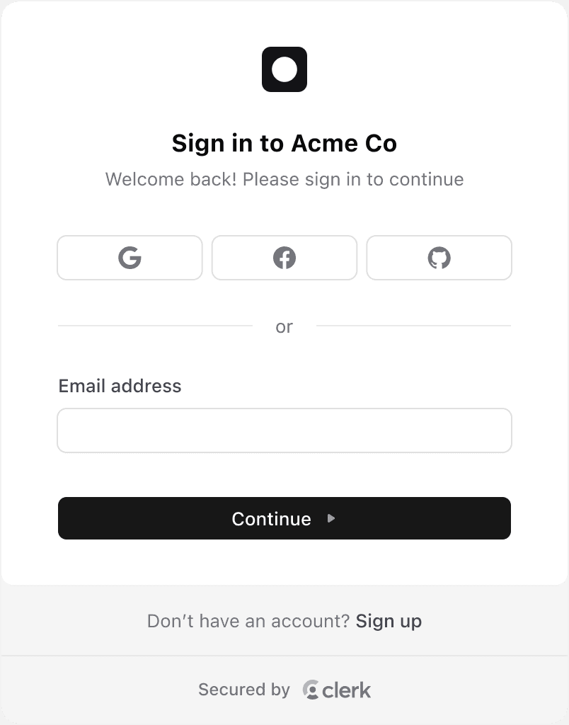
Themes
Clerk currently offers six prebuilt themes:
- The default theme
- The "shadcn" theme
- The "Dark" theme
- The "Shades of Purple" theme
- The "Neobrutalism" theme
- The "Simple" theme
Default theme
Applied by default when no other theme is provided.
When using the shadcn/ui library, you can use the shadcn theme to apply the shadcn/ui styles to your Clerk components. This will adapt to both light and dark mode automatically.

"Simple" theme
This theme is a stripped down "Default" theme that removes some more advanced styling techniques, making it easier to apply your own custom styles.
To use the simple theme, set theme to simple:
<ClerkProvider
  appearance={{
    theme: 'simple',
  }}
/>
Usage
-
To get started, install the
@clerk/themespackage.terminal npm install @clerk/themesterminal yarn add @clerk/themesterminal pnpm add @clerk/themesterminal bun add @clerk/themes -
To use a theme, import it from
@clerk/themesand pass it to theappearanceprop of a Clerk component.
Apply a theme to all Clerk components
To apply a theme to all Clerk components, pass the appearance prop to the <ClerkProvider> component. The appearance prop accepts the property baseTheme, which can be set to a theme.
In the following example, the "Dark" theme is applied to all Clerk components.
import { ClerkProvider } from '@clerk/nextjs'
import { dark } from '@clerk/themes'

export default function RootLayout({ children }: { children: React.ReactNode }) {
  return (
    <ClerkProvider
      appearance={{
        baseTheme: dark,
      }}
    >
      <html lang="en">
        <body>{children}</body>
      </html>
    </ClerkProvider>
  )
}import { ClerkProvider } from '@clerk/nextjs'
import { dark } from '@clerk/themes'
import type { AppProps } from 'next/app'
function MyApp({ Component, pageProps }: AppProps) {
return (
<ClerkProvider
appearance={{
baseTheme: dark,
}}
>
<Component {...pageProps} />
</ClerkProvider>
)
}
export default MyAppimport React from 'react'
import './App.css'
import { dark } from '@clerk/themes'
import { ClerkProvider } from '@clerk/clerk-react'
if (!process.env.REACT_APP_CLERK_PUBLISHABLE_KEY) {
throw new Error('Missing Publishable Key')
}
const clerkPubKey = process.env.REACT_APP_CLERK_PUBLISHABLE_KEY
function App() {
return (
<ClerkProvider
appearance={{
baseTheme: dark,
}}
publishableKey={clerkPubKey}
>
<div>Hello from clerk</div>
</ClerkProvider>
)
}
export default Appimport clerk from '@clerk/astro'
import { dark } from '@clerk/themes'
export default defineConfig({
integrations: [
clerk({
appearance: {
baseTheme: dark,
},
}),
],
})// Import ClerkApp
import { ClerkApp } from '@clerk/remix'
import { dark } from '@clerk/themes'
import type { MetaFunction, LoaderFunction } from '@remix-run/node'
import { Links, LiveReload, Meta, Outlet, Scripts, ScrollRestoration } from '@remix-run/react'
import { rootAuthLoader } from '@clerk/remix/ssr.server'
export const meta: MetaFunction = () => ({
charset: 'utf-8',
title: 'New Remix App',
viewport: 'width=device-width,initial-scale=1',
})
export const loader: LoaderFunction = (args) => rootAuthLoader(args)
function App() {
return (
<html lang="en">
<head>
<Meta />
<Links />
</head>
<body>
<Outlet />
<ScrollRestoration />
<Scripts />
<LiveReload />
</body>
</html>
)
}
export default ClerkApp(App, {
appearance: {
baseTheme: dark,
},
})import { createApp } from 'vue'
import App from './App.vue'
import { clerkPlugin } from '@clerk/vue'
import { dark } from '@clerk/themes'
const app = createApp(App)
app.use(clerkPlugin, {
appearance: {
baseTheme: dark,
},
})
app.mount('#app')import { dark } from '@clerk/themes'
export default defineNuxtConfig({
modules: ['@clerk/nuxt'],
clerk: {
appearance: {
baseTheme: dark,
},
},
})Apply multiple themes
You can also stack themes by passing an array of themes to the baseTheme property of the appearance prop. The themes will be applied in the order they are listed. If styles overlap, the last defined theme will take precedence.
In the following example, the "Dark" theme is applied first, then the "Neobrutalism" theme is applied on top of it.
import { ClerkProvider } from '@clerk/nextjs'
import { dark, neobrutalism } from '@clerk/themes'

export default function RootLayout({ children }: { children: React.ReactNode }) {
  return (
    <ClerkProvider
      appearance={{
        baseTheme: [dark, neobrutalism],
      }}
    >
      <html lang="en">
        <body>{children}</body>
      </html>
    </ClerkProvider>
  )
}import { ClerkProvider, SignIn } from '@clerk/nextjs'
import { dark, neobrutalism } from '@clerk/themes'
import type { AppProps } from 'next/app'
function MyApp({ Component, pageProps }: AppProps) {
return (
<ClerkProvider
appearance={{
baseTheme: [dark, neobrutalism],
}}
>
<Component {...pageProps} />
</ClerkProvider>
)
}
export default MyAppimport React from 'react'
import './App.css'
import { dark, neobrutalism } from '@clerk/themes'
import { ClerkProvider } from '@clerk/clerk-react'
if (!process.env.REACT_APP_CLERK_PUBLISHABLE_KEY) {
throw new Error('Missing Publishable Key')
}
const clerkPubKey = process.env.REACT_APP_CLERK_PUBLISHABLE_KEY
function App() {
return (
<ClerkProvider
appearance={{
baseTheme: [dark, neobrutalism],
}}
publishableKey={clerkPubKey}
>
<div>Hello from clerk</div>
</ClerkProvider>
)
}
export default Appimport clerk from '@clerk/astro'
import { dark, neobrutalism } from '@clerk/themes'
export default defineConfig({
integrations: [
clerk({
appearance: {
baseTheme: [dark, neobrutalism],
},
}),
],
})// Import ClerkApp
import { ClerkApp } from '@clerk/remix'
import { dark, neobrutalism } from '@clerk/themes'
import type { MetaFunction, LoaderFunction } from '@remix-run/node'
import { Links, LiveReload, Meta, Outlet, Scripts, ScrollRestoration } from '@remix-run/react'
import { rootAuthLoader } from '@clerk/remix/ssr.server'
export const meta: MetaFunction = () => ({
charset: 'utf-8',
title: 'New Remix App',
viewport: 'width=device-width,initial-scale=1',
})
export const loader: LoaderFunction = (args) => rootAuthLoader(args)
function App() {
return (
<html lang="en">
<head>
<Meta />
<Links />
</head>
<body>
<Outlet />
<ScrollRestoration />
<Scripts />
<LiveReload />
</body>
</html>
)
}
export default ClerkApp(App, {
appearance: {
baseTheme: [dark, neobrutalism],
},
})import { createApp } from 'vue'
import App from './App.vue'
import { clerkPlugin } from '@clerk/vue'
import { dark, neobrutalism } from '@clerk/themes'
const app = createApp(App)
app.use(clerkPlugin, {
appearance: {
baseTheme: [dark, neobrutalism],
},
})
app.mount('#app')import { dark, neobrutalism } from '@clerk/themes'
export default defineNuxtConfig({
modules: ['@clerk/nuxt'],
clerk: {
appearance: {
baseTheme: [dark, neobrutalism],
},
},
})Apply a theme to all instances of a Clerk component
You can apply a theme to all instances of a Clerk component by passing the component to the appearance prop of the <ClerkProvider>. The appearance prop accepts the name of the Clerk component you want to style as a key.
In the following example, the "Neobrutalism" theme is applied to all instances of the <SignIn /> component.
import { ClerkProvider } from '@clerk/nextjs'
import { dark, neobrutalism } from '@clerk/themes'

export default function RootLayout({ children }: { children: React.ReactNode }) {
  return (
    <ClerkProvider
      appearance={{
        baseTheme: dark,
        signIn: { baseTheme: neobrutalism },
      }}
    >
      <html lang="en">
        <body>{children}</body>
      </html>
    </ClerkProvider>
  )
}import { ClerkProvider, SignIn } from '@clerk/nextjs'
import { dark } from '@clerk/themes'
import type { AppProps } from 'next/app'
function MyApp({ Component, pageProps }: AppProps) {
return (
<ClerkProvider
appearance={{
baseTheme: dark,
signIn: { baseTheme: neobrutalism },
}}
>
<Component {...pageProps} />
</ClerkProvider>
)
}
export default MyAppimport React from 'react'
import './App.css'
import { dark } from '@clerk/themes'
import { ClerkProvider } from '@clerk/clerk-react'
if (!process.env.REACT_APP_CLERK_PUBLISHABLE_KEY) {
throw new Error('Missing Publishable Key')
}
const clerkPubKey = process.env.REACT_APP_CLERK_PUBLISHABLE_KEY
function App() {
return (
<ClerkProvider
appearance={{
baseTheme: dark,
signIn: { baseTheme: neobrutalism },
}}
publishableKey={clerkPubKey}
>
<div>Hello from clerk</div>
</ClerkProvider>
)
}
export default Appimport clerk from '@clerk/astro'
import { dark } from '@clerk/themes'
export default defineConfig({
integrations: [
clerk({
appearance: {
baseTheme: dark,
signIn: { baseTheme: neobrutalism },
},
}),
],
})// Import ClerkApp
import { ClerkApp } from '@clerk/remix'
import { dark } from '@clerk/themes'
import type { MetaFunction, LoaderFunction } from '@remix-run/node'
import { Links, LiveReload, Meta, Outlet, Scripts, ScrollRestoration } from '@remix-run/react'
import { rootAuthLoader } from '@clerk/remix/ssr.server'
export const meta: MetaFunction = () => ({
charset: 'utf-8',
title: 'New Remix App',
viewport: 'width=device-width,initial-scale=1',
})
export const loader: LoaderFunction = (args) => rootAuthLoader(args)
function App() {
return (
<html lang="en">
<head>
<Meta />
<Links />
</head>
<body>
<Outlet />
<ScrollRestoration />
<Scripts />
<LiveReload />
</body>
</html>
)
}
export default ClerkApp(App, {
appearance: {
baseTheme: dark,
signIn: { baseTheme: neobrutalism },
},
})import { createApp } from 'vue'
import App from './App.vue'
import { clerkPlugin } from '@clerk/vue'
import { dark, neobrutalism } from '@clerk/themes'
const app = createApp(App)
app.use(clerkPlugin, {
appearance: {
baseTheme: dark,
signIn: { baseTheme: neobrutalism },
},
})
app.mount('#app')import { dark, neobrutalism } from '@clerk/themes'
export default defineNuxtConfig({
modules: ['@clerk/nuxt'],
clerk: {
appearance: {
baseTheme: dark,
signIn: { baseTheme: neobrutalism },
},
},
})Apply a theme to a single Clerk component
To apply a theme to a single Clerk component, pass the appearance prop to the component. The appearance prop accepts the property baseTheme, which can be set to a theme.
import { SignIn } from '@clerk/nextjs'
import { dark } from '@clerk/themes'

export default function Page() {
  return (
    <SignIn
      appearance={{
        baseTheme: dark,
      }}
    />
  )
}import { SignIn } from '@clerk/nextjs'
import { dark } from '@clerk/themes'
const SignInPage = () => (
<SignIn
appearance={{
baseTheme: dark,
}}
/>
)
export default SignInPageimport { SignIn } from '@clerk/clerk-react'
import { dark } from '@clerk/themes'
const SignInPage = () => (
<SignIn
appearance={{
baseTheme: dark,
}}
/>
)
export default SignInPage---
import { SignIn } from '@clerk/astro/components'
import { dark } from '@clerk/themes'
---
<SignIn
appearance={{
baseTheme: dark,
}}
/>import { SignIn } from '@clerk/remix'
import { dark } from '@clerk/themes'
export default function SignInPage() {
return (
<div style={{ border: '2px solid blue', padding: '2rem' }}>
<h1>Sign In route</h1>
<SignIn
appearance={{
baseTheme: dark,
}}
/>
</div>
)
}<script setup lang="ts">
import { SignIn } from '@clerk/vue'
import { dark } from '@clerk/themes'
</script>
<template>
<SignIn :appearance="{ baseTheme: dark }" />
</template><script setup lang="ts">
// Components are automatically imported
import { dark } from '@clerk/themes'
</script>
<template>
<SignIn :appearance="{ baseTheme: dark }" />
</template>Customize a theme using variables
You can customize a theme by passing an object of variables to the variables property of the appearance prop. The variables property is used to adjust the general styles of the component's base theme, like colors, backgrounds, typography.
In the following example, the primary color of the themes are customized.
import { ClerkProvider } from '@clerk/nextjs'
import { dark, neobrutalism, shadesOfPurple } from '@clerk/themes'

export default function RootLayout({ children }: { children: React.ReactNode }) {
  return (
    <ClerkProvider
      appearance={{
        baseTheme: [dark, neobrutalism],
        variables: { colorPrimary: 'blue' },
        signIn: {
          baseTheme: [shadesOfPurple],
          variables: { colorPrimary: 'green' },
        },
      }}
    >
      <html lang="en">
        <body>{children}</body>
      </html>
    </ClerkProvider>
  )
}import { ClerkProvider } from '@clerk/nextjs'
import { dark, neobrutalism, shadesOfPurple } from '@clerk/themes'
import type { AppProps } from 'next/app'
function MyApp({ Component, pageProps }: AppProps) {
return (
<ClerkProvider
appearance={{
baseTheme: [dark, neobrutalism],
variables: { colorPrimary: 'blue' },
signIn: {
baseTheme: [shadesOfPurple],
variables: { colorPrimary: 'blue' },
},
}}
>
<Component {...pageProps} />
</ClerkProvider>
)
}
export default MyAppimport React from 'react'
import './App.css'
import { dark, neobrutalism, shadesOfPurple } from '@clerk/themes'
import { ClerkProvider } from '@clerk/clerk-react'
if (!process.env.REACT_APP_CLERK_PUBLISHABLE_KEY) {
throw new Error('Missing Publishable Key')
}
const clerkPubKey = process.env.REACT_APP_CLERK_PUBLISHABLE_KEY
function App() {
return (
<ClerkProvider
appearance={{
baseTheme: [dark, neobrutalism],
variables: { colorPrimary: 'blue' },
signIn: {
baseTheme: [shadesOfPurple],
variables: { colorPrimary: 'blue' },
},
}}
publishableKey={clerkPubKey}
>
<div>Hello from clerk</div>
</ClerkProvider>
)
}
export default Appimport clerk from '@clerk/astro'
import { dark, neobrutalism, shadesOfPurple } from '@clerk/themes'
export default defineConfig({
integrations: [
clerk({
appearance: {
baseTheme: [dark, neobrutalism],
variables: { colorPrimary: 'blue' },
signIn: {
baseTheme: [shadesOfPurple],
variables: { colorPrimary: 'blue' },
},
},
}),
],
})// Import ClerkApp
import { ClerkApp } from '@clerk/remix'
import { dark, neobrutalism, shadesOfPurple } from '@clerk/themes'
import type { MetaFunction, LoaderFunction } from '@remix-run/node'
import { Links, LiveReload, Meta, Outlet, Scripts, ScrollRestoration } from '@remix-run/react'
import { rootAuthLoader } from '@clerk/remix/ssr.server'
export const meta: MetaFunction = () => ({
charset: 'utf-8',
title: 'New Remix App',
viewport: 'width=device-width,initial-scale=1',
})
export const loader: LoaderFunction = (args) => rootAuthLoader(args)
function App() {
return (
<html lang="en">
<head>
<Meta />
<Links />
</head>
<body>
<Outlet />
<ScrollRestoration />
<Scripts />
<LiveReload />
</body>
</html>
)
}
export default ClerkApp(App, {
appearance: {
baseTheme: [dark, neobrutalism],
variables: { colorPrimary: 'blue' },
signIn: {
baseTheme: [shadesOfPurple],
variables: { colorPrimary: 'blue' },
},
},
})import { createApp } from 'vue'
import App from './App.vue'
import { clerkPlugin } from '@clerk/vue'
import { dark, neobrutalism, shadesOfPurple } from '@clerk/themes'
const app = createApp(App)
app.use(clerkPlugin, {
appearance: {
baseTheme: [dark, neobrutalism],
variables: { colorPrimary: 'blue' },
signIn: {
baseTheme: [shadesOfPurple],
variables: { colorPrimary: 'blue' },
},
},
})
app.mount('#app')import { dark, neobrutalism, shadesOfPurple } from '@clerk/themes'
export default defineNuxtConfig({
modules: ['@clerk/nuxt'],
clerk: {
appearance: {
baseTheme: [dark, neobrutalism],
variables: { colorPrimary: 'blue' },
signIn: {
baseTheme: [shadesOfPurple],
variables: { colorPrimary: 'blue' },
},
},
},
})Feedback
Last updated on